This is the second part of the material dedicated to Oracle Analytics. In Part 1, we started our journey and learned to create Reference Line, Forecast Line with Sales data. It let us get some essential remarks about the products with outstanding performance or relations between Sales and Profit.
In this part, we are going to continue using Advanced features. Here, our goal is to create Outliers and Clusters to identify abnormal data points in datasets and identify the grouping of customers.
Before we start our new tasks, it is recommended that you refresh your knowledge by turning to the previous part of the material. We will use the project setup at that stage.
Table of contents
Using the Outlier Line
The purpose of Outlier is to highlight anomalies in data points on a given visual. It offers K-Means and Hierarchical Clustering algorithms
- Create a new canvas and drag and drop City and Sales into the Visualization panel
- Choose the Category chart type
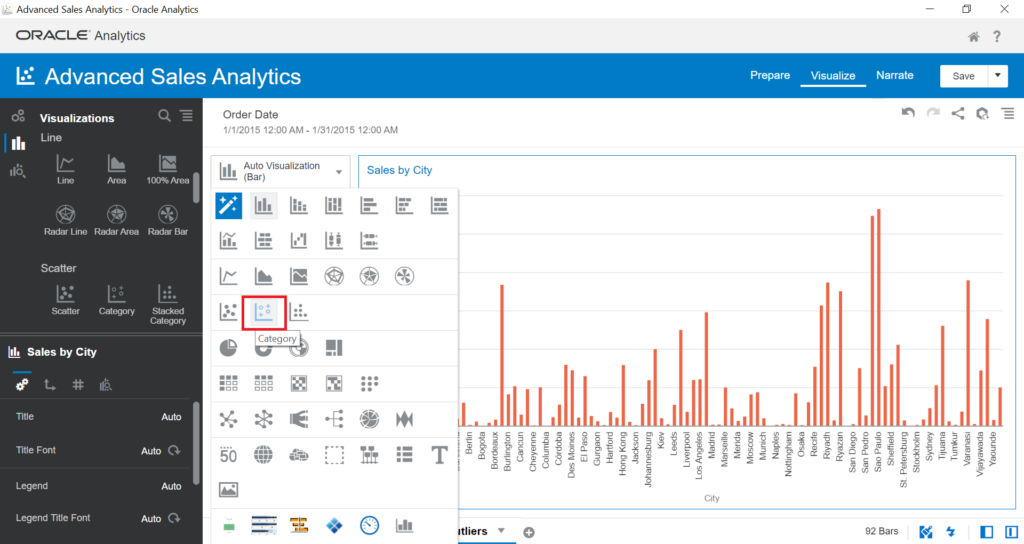
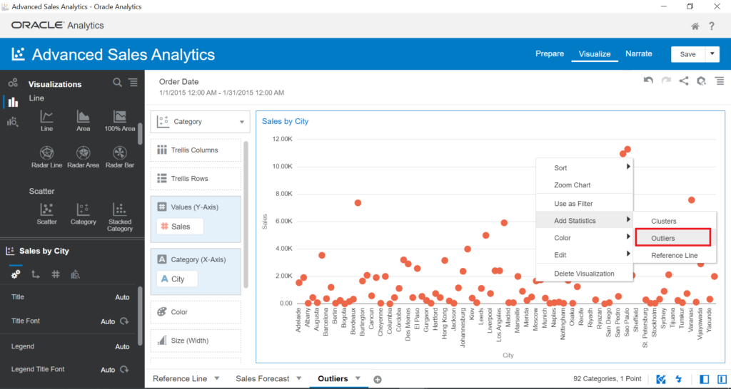
- Right-click on the Visual > Add Statistics > Outliers
- Remove Order Date out of the filter panel
In the visual, you can see the outliers (anomalies) in green. These data points are at both the top and bottom sides, such as Hong Kong city. These outliers require further investigation.
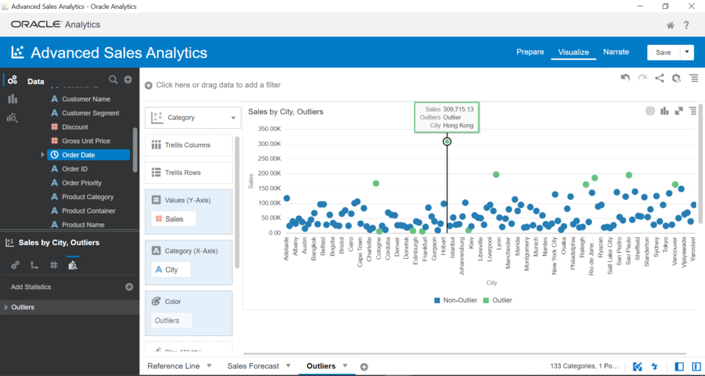
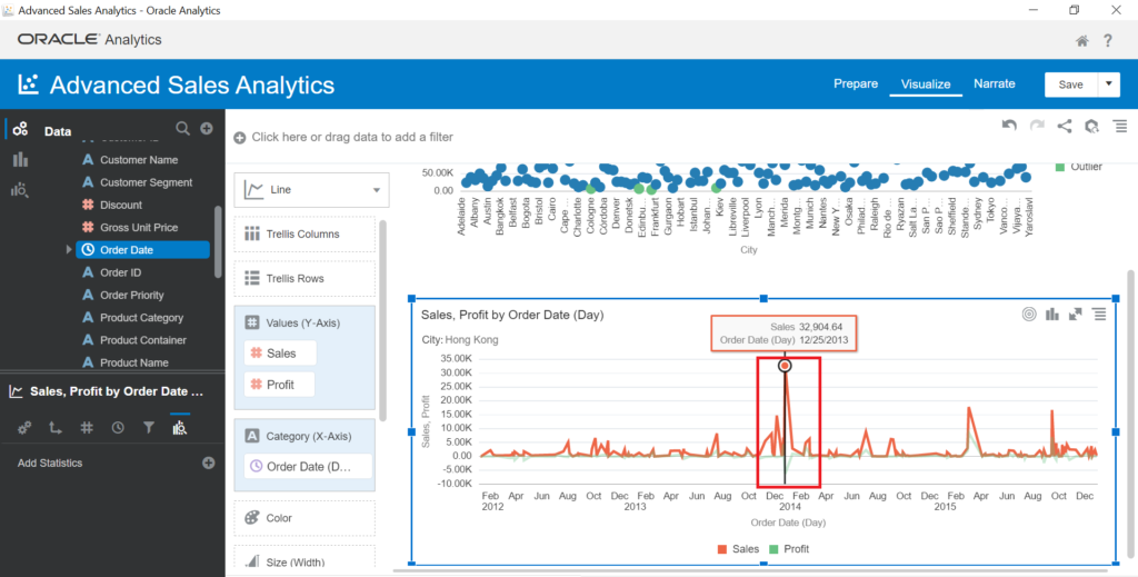
In our case, to investigate why Hong Kong is an outlier, we create a new visual. It will show what happened and the relation between Sales and Profit.
- Drag and drop Sales and Profit into the Visualization panel. Choose the Line chart type
- Drag and drop Order Date into Category (X-Axis)
The visual displays abnormal Sales of 25-Dec-2013 on the Line chart – Sales go up very high. From this, we can continue to drill down data to the detail level.
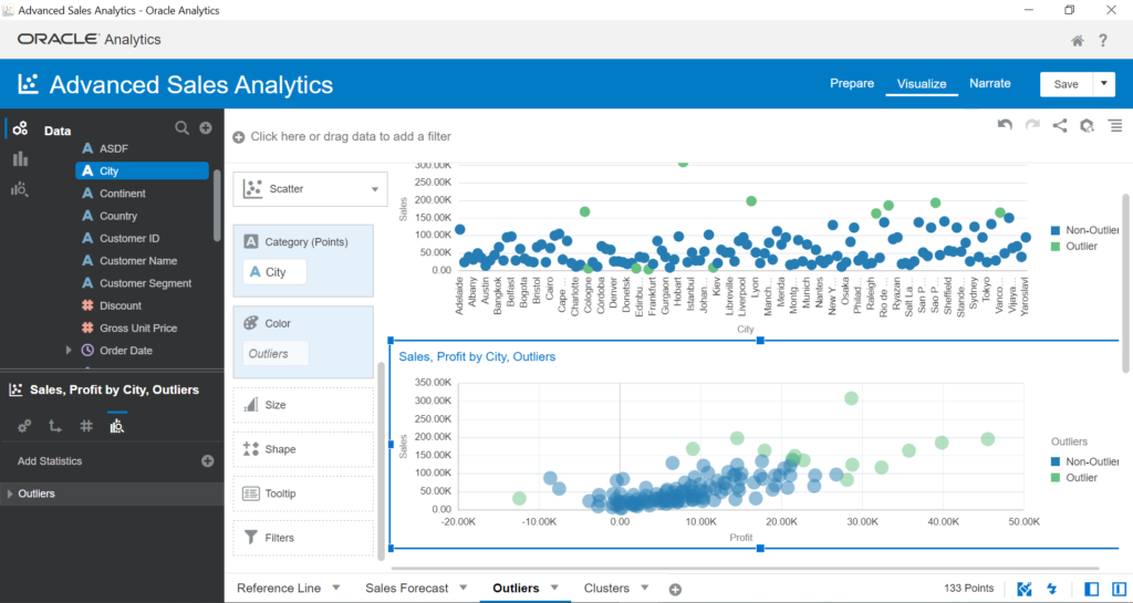
Now, let’s try to highlight outliers with multiple measures.
- Drag and drop City, Profit Sales into Visualization panel
- Choose the Scatter chart type and Add Statistics > Outlier
The classifications of Outliers are different based on measures:
Using Clusters
The purpose of Cluster Analysis is to identify homogenous groups of data points. It also offers K-Means and Hierarchical Clustering algorithms.
- Create a new canvas within the Clusters name
- Drag and drop City, Profit Sales into the Visualization panel
- Choose the Scatter chart type and Add Statistics > Clusters
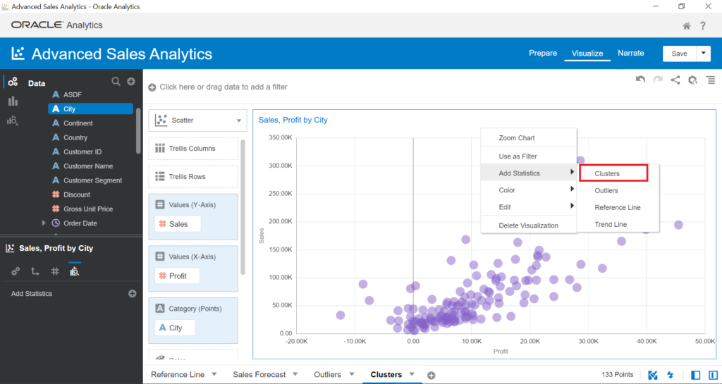
The visual clusters your data points to 5 groups. In the left-bottom panel, you can change the number of groups by updating Groups:
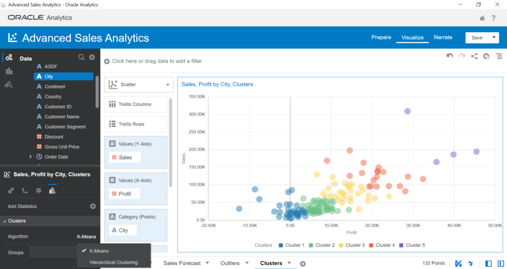
Clusters are a useful feature that helps to identify homogenous groups or segmentation of your customers. Clustered groups let you understand more about customers having the same distinctions like demographics or behaviors.
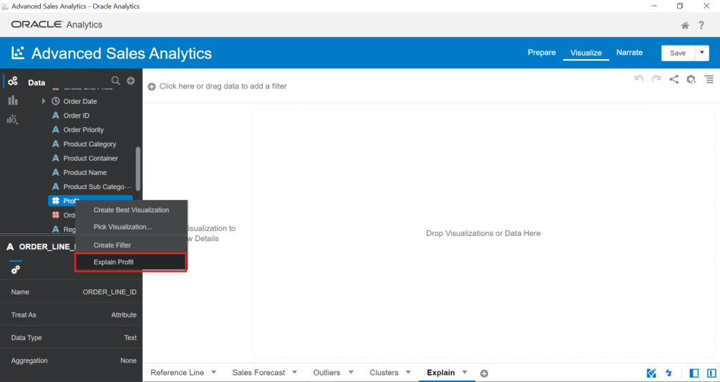
Using the Explain Feature
Advance Analytics features let us dive into the datasets with the help of Trend Line, Forecast, Outliers, or Clusters. However, you need to apply those features manually. On the other hand, Oracle Analytics also includes automated processes to quickly recognize the dataset patterns and trends, find out outliers (anomalies), and isolate segments with the highest predictive significance. This feature is Explain in Oracle Analytics.
- Create a new canvas named Explain
- Right-click on Profit > Explain Profit
This feature is Machine Learning (ML). It presents how selected measures relate to all attributes in your dataset. It also presents the Anomalies‘ functionality.
The Basic Facts about Profit section shows the list of visuals – the Profit values, and how they relate to each other. You can choose any visual to add to your canvas.
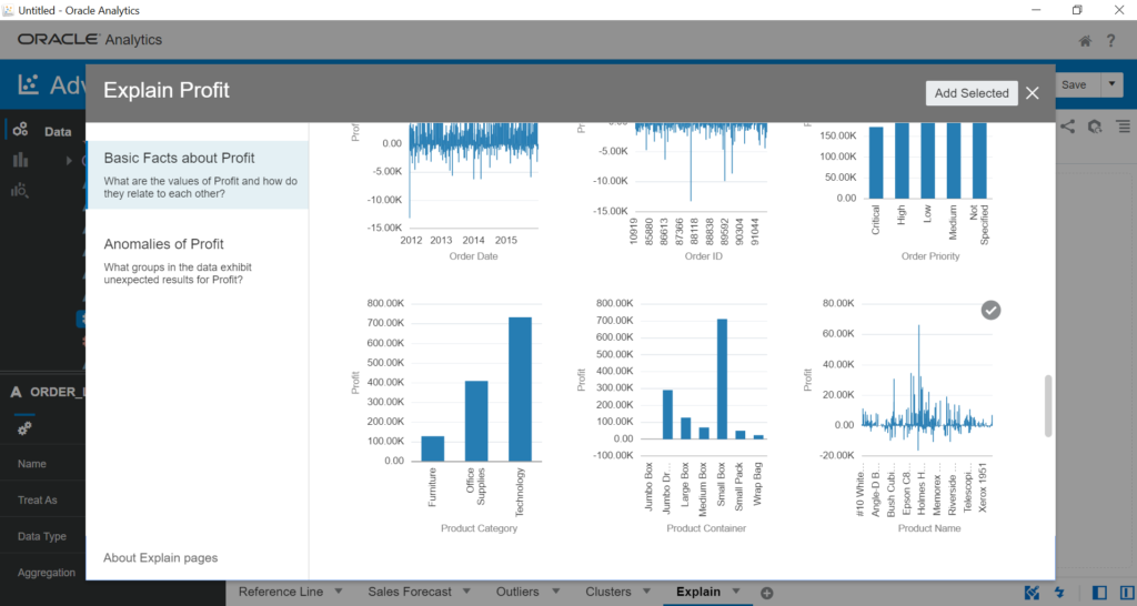
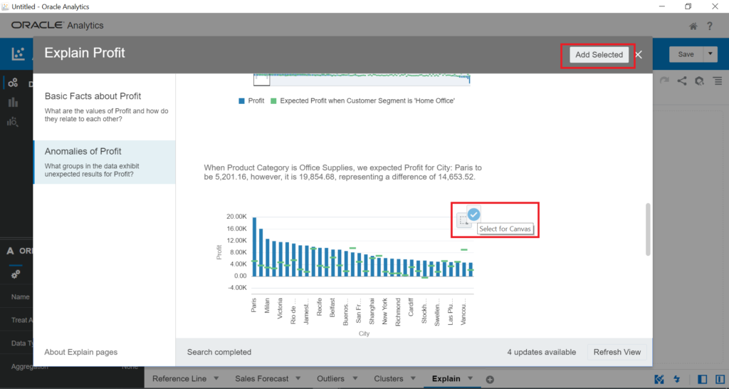
Click on Anomalies of Profit – this functionality presents unexpected results of Profit. For instance, you can see the generated automated stories:
- When Ship Mode is Delivery Truck, we expected Profit for City: Sao Paulo to be 9,617.48. However, it is 21,317.51. The difference is 11,700.03.
- When the Product Category is Office Supplies, we expected Profit for City: Paris to be 5,201.16. However, it is 19,854.68. The difference is 14,653.52.
Let’s verify the story of how the Paris profit is an outlier when the Product Category is Office Supplies. If we want to add automated visual into canvas, click on the tick button on this visual > Add Selected:
- Drag and drop Profit and City into Visualization
- Choose the Category chart type
- Add Product Category to the canvas filter and choose the Office Supplies product category
- Add Outliers to the visual
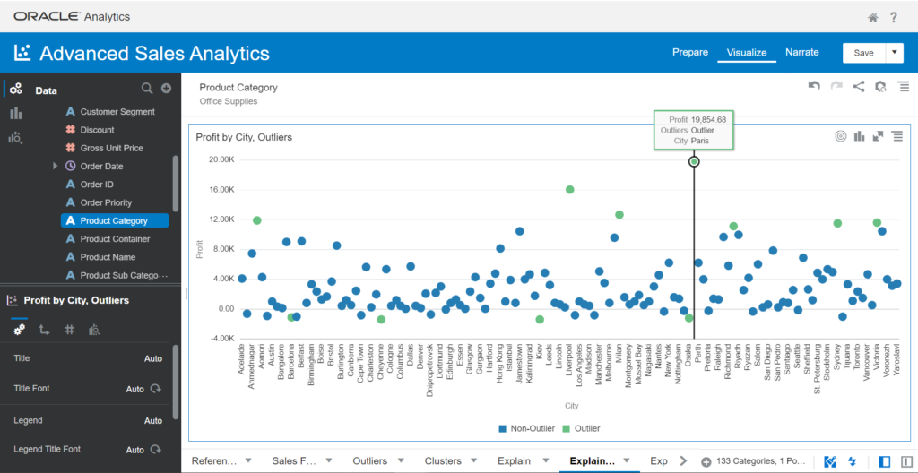
As you see, Paris is the outlier of the profit data point.
It’s similar to the Explain feature when it provides automated visuals instead of using manual Outlier functionality.
Conclusion
The current tutorial helped us to discover such efficient Advanced Analytics features as Clusters, Outliers, and Explain.
Outliers highlight anomalies of the dataset and discover their reasons in business operation.
Clusters highlight homogenous groups. You can apply the feature to find clustered customers within the same characteristics, behaviors, etc. It helps running campaigns more effectively.
Explain is an automated process that helps users to work on the above-mentioned features automatically.
Depending on your requirements, you will choose suitable functionalities and apply them to your analysis.
Tags: advanced analytics, oracle, oracle analytics Last modified: September 22, 2022