Contents
- Introduction.
- How to create a table.
- How to create a Power BI pie chart.
- Creating a line chart in Power BI.
- Report creation.
- Conclusion.
Introduction
The final article will take us through Power BI Visualizations and how to create them using the data sets created previously in these series. The walkthrough will cover 3 basic Visualizations: Table, Pie Chart, and Line Chart. These will then combine to create a basic report/dashboard within Power BI.
How to create a table
The table visual is one of the more basic options available to us, however, possibly one of the most common also! Like an Excel sheet, we can create a ‘list’ within the visual to which we can scroll and filter.
Step 1
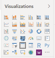
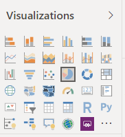
Select the ‘Table’ visual from the Visualizations options.
Step 2
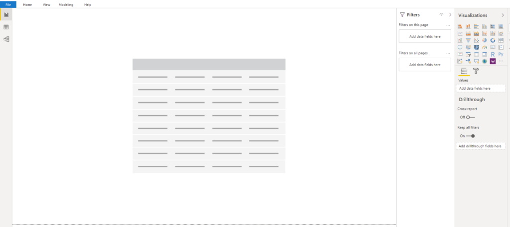
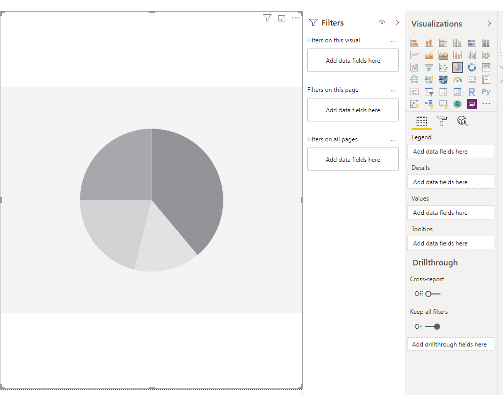
The below greyed-out box will now have appeared in your center screen, click on this box to bring up the values pane.
Step 3
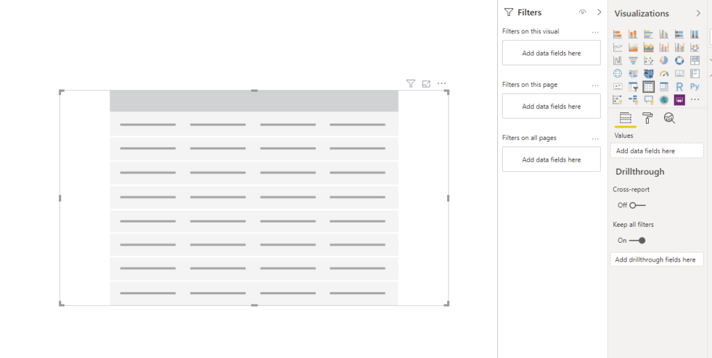
The table is now selected; note, in the visualization pane, the ‘table’ icon is now highlighted.
Step 4
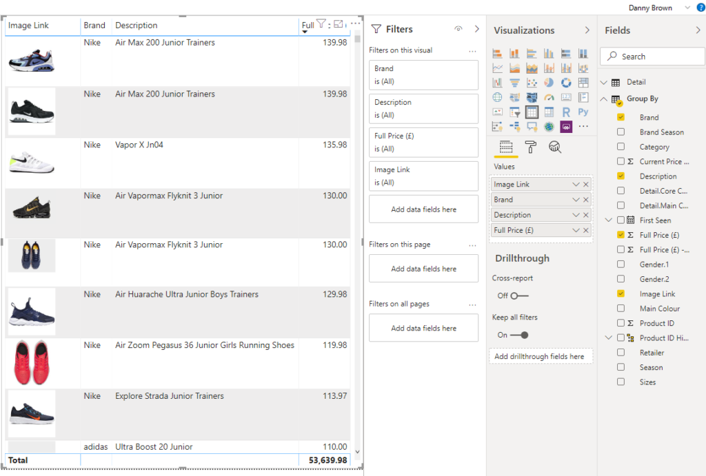
Identify the fields you want to display in the table, you can drag and drop or check the field. The fields we’re going to display here are Image Link (URL Format to ensure the image is displayed), Brand, Description, and Full Price.
How to create a Power BI pie chart
The table visual is one of the more basic options available to us, however, possibly one of the most common also! Like an Excel sheet, we can create a ‘list’ within the visual to which we can scroll and filter.
Step 1
Select the ‘Pie Chart’ visual from the Visualizations options.
Step 2
As above the below greyed-out box will now have appeared in your center screen, click on this box to bring up the values pane.
Step 3
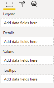
The Pie Chart is now selected, note in the visualization pane. The Pie Chart has 4 fields, unlike Table 1. This is because the Table is simply a list, whereas the Pie Chart is an analysis tool. The fields are consistent with any chart you’ve used in Excel, so should come as no surprise, the ‘Tooltips’ enable us to add any additional information that will be displayed when hovered over.
Step 4
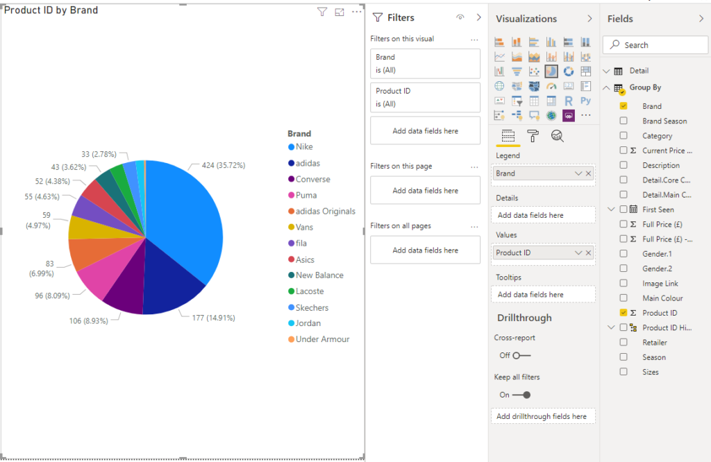
For now, we just need to see who holds the greatest share. So just like above, drag and drop or check the fields we require. The legend will be set as ‘Brand’, and the value will be the count of ‘Product ID’.
Step 5
Currently, the Pie Chart looks quite busy with product id counts plus percentage splits: all we need to see, for now, is the actual percentage splits. If you click onto the ‘Format’ option, (the roller) a menu will be highlighted. Click on ‘Detail Labels’ drop down and select ‘Percent of Total’.
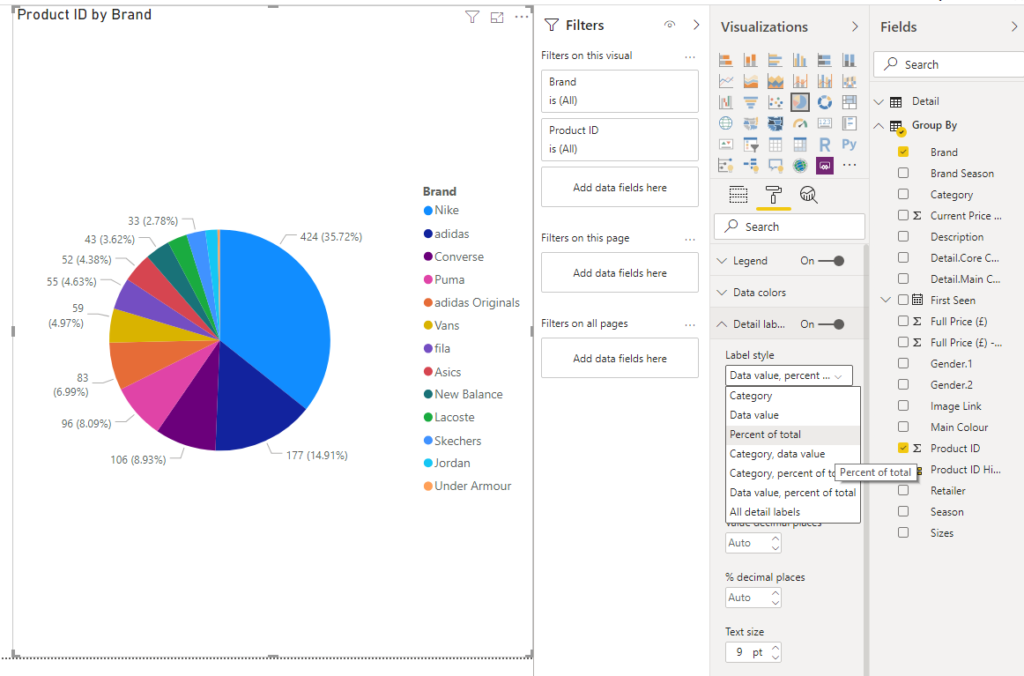
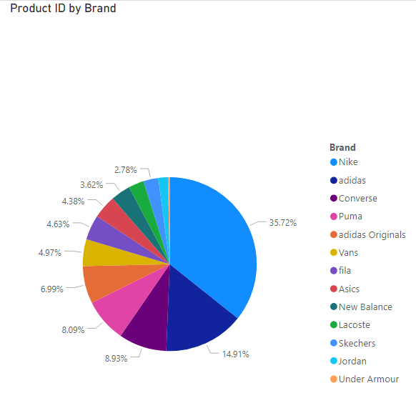
Step 6
The Pie Chart now only contains percentage splits and is much easier on the eye — this will look better in our final report.
Creating a line chart in Power BI
The Line Chart is best used when analysing changes over time.
Step 1
Select the ‘Line Chart’ visual from the Visualizations options.
Step 2
Again, the greyed-out box appears together with the value pane.
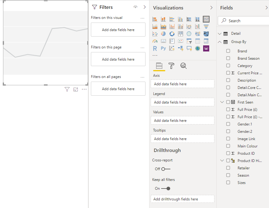
Step 3
We want the line chart to display when the products have first launched: to do this, we’re going to drag ‘First Seen’ into the Axis field and ‘Product ID’ into the Values field.
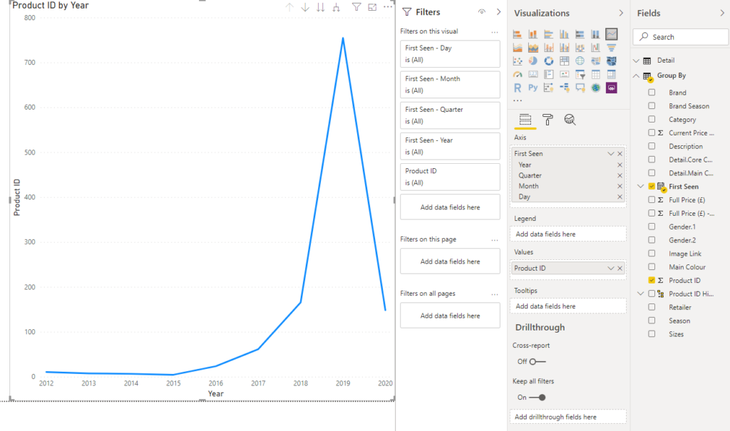
Step 4
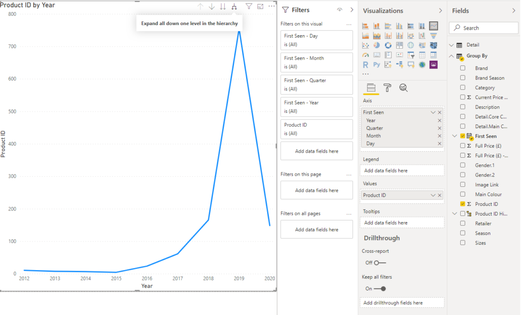
The steep line indicates that the majority of products were launched in 2019. To deep dive into the timeline, click the ‘Expand All’ option.
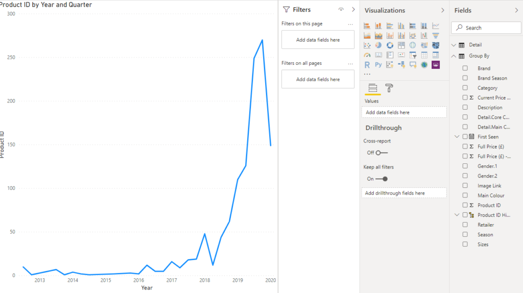
Step 5
The timeline has now been broken down by quarter, so we can see greater detail regarding product launches. If you want to further deep dive into the data, add the brand into the legend, and see what happens.
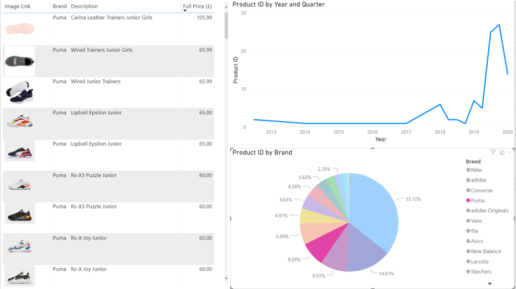
Report creation
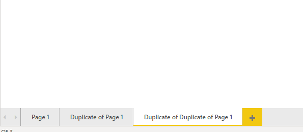
Step 1
Create a New Page by clicking on the ‘+’ option. This will create a blank page we can collate all our charts on (or you can recreate all the charts from scratch for practice)
Step 2
Copy and Paste the three visualizations onto the new blank page and re-size until you’re happy with the layout.
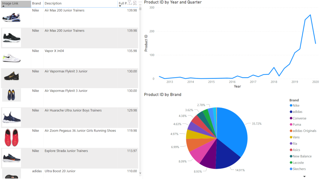
Step 3
Begin experimenting with the report by clicking into the different visualizations: if you click into a section of the Pie Chart, the Table will display only relevant brand products, while the Line Chart will display when these products launch if clicked inside the table. (Puma was selected in this case)
Conclusion
Now that we have completed this, you can hopefully see just how powerful and user-friendly power BI is. Analysis that would have taken specialists, software and users hours to complete can now be carried out at the click of a button.
Tags: excel, excel power query, microsoft office, power bi, sql Last modified: September 20, 2021