This article completes the series of posts dedicated to Advanced Analytics with Oracle Data Analytics. Previously, we explored such metrics as Reference Line and Forecast Line in Part 1, and Outliers, Clusters, and Explain features in Part 2. The drag-and-drop methodology helps to build your informative and interactive visuals to view the data.
This part of the material will focus on the Express Builder functionality. This feature is especially helpful for advanced users who possess a deeper understanding of data science and statistics. It is necessary because users need more control over advanced functions and parameters. It also offers running Python scripts for data analysis.
Refer to the previous articles on the topic to refresh your knowledge. We are going to continue working with the project assignment in Part 1 and Part 2 to understand advanced functions provided by Oracle Data Analytics.
Table of contents
Creating Trendline Function
Before we start the configuration, we should get familiar with the essential terms we’ll deal with in this article.
Trendline definition is a function that fits a linear or exponential model and returns the fitted values or model. The numeric_expr represents the Y value for the trend. The series (time columns) represent the X value.
Syntax:
TRENDLINE(numeric_expr, ([series]) BY ([partitionBy]), model_type, result_type)- numeric_expr represents the data to the trend. This is the Y-axis, usually a measure column.
- series is the X-axis is a list of numerics or time dimension attribute columns.
- partitionBY is a list of dimension attribute columns that are in the view but not on the X-axis.
- model_type is one of the following (‘LINEAR’, ‘EXPONENTIAL’).
- result_type is one of the following (‘VALUE’, ‘MODEL’). ‘VALUE‘ will return all the regression Y values given X in the fit. ‘MODEL’ will return all the parameters in a JSON format string.
Example:
TRENDLINE(revenue, (calendar_year, calendar_quarter, calendar_month) BY (product), 'LINEAR', 'VALUE')To build the function, do the following:
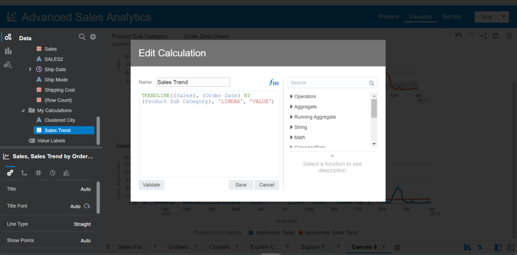
- Right-click on My Calculation > Add Calculation
- Enter the name: Sales Trend
- Enter the expression:
TRENDLINE((Sales),(Order Date) BY (Product Sub Category), 'LINEAR', 'VALUE')In this expression
- numeric_expr = Sales
- series = Order Date (Time dimension)
- partitionBy = Product Sub Category
- model_type = LINEAR
- result_type = VALUE
The purpose of this expression is to build the Trend of Product Sub Category using Linear regression. Remember that the Trend or Forecast functions are based on the Time series, so they require Time dimension as well.
- Drag and drop Sales and Order Date into Visualization
- Choose the Line chart type
- Right-click on the visual > Add statistics > Trend
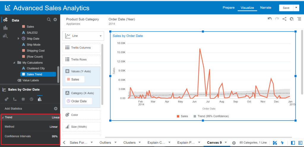
- Drag and drop Product Sub Category and Year of Order Date into Filter Canvas
- Filter Product Sub Category with Appliances and Year of 2014
Now, let’s build another visual with the Sales Trend calculation created.
- Drag and drop Sales, Sales Trend (Values (Y-Axis)) and Order Date (Category (X-Axis)) into Visualization
- Choose the Line chart type
- Drag and drop Product Sub Category into Color in the visual
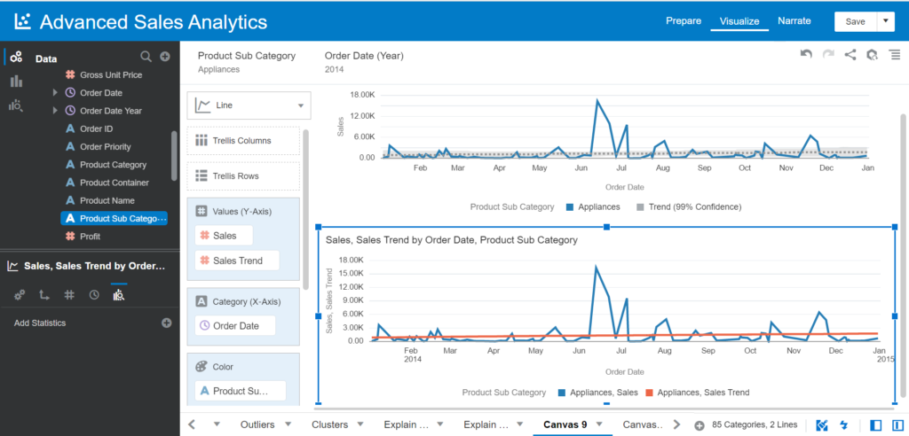
In this visual, we use a customized function with the Sales Trend calculation using the Trendline function instead of using the Trend feature as you did. The Trend line is the same on both visuals
Creating the Forecast Function
The Forecast function creates the time-series model of the specified measure over the series using either Exponential Smoothing or ARIMA. It outputs a forecast for the set of periods as specified by the numPeriods.
Syntax:
FORECAST(numeric_expr, ([series]), output_column_name, options, [runtime_binded_options])- numeric _expr represents the measure to forecast.
- series is the time grain at which the forecast model is built. It is a list of one or multiple time dimension columns. If the series is omitted, the time grain gets determined from the query.
- output_column_name is the output column. The valid values are ‘forecast’, ‘low’, ‘high’, ‘predictionInterval’
- options state for the string list of name=value pairs separated by ‘;’. The value can include %1 … %N, specified using runtime_binded_options.
- runtime_binded_options is an optional comma-separated list of runtime bound columns or literal expressions.
Example:
FORECAST(revenue, (time_year, time_quarter), 'forecast', 'modelType=arima;numPeriods=%1;predictionInterval=70;', 3)Now, let’s work with an example. Create a new calculation and enter the name Sales Forecast. We are creating a Forecast of Sales for the next 90 days using the ARIMA algorithm and a Confident interval of 70%
Enter the expression:
FORECAST(Sales, (Order Date), 'forecast', 'modelType=arima;numPeriods=90;predictionInterval=90;')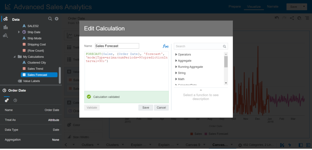
- Click Save
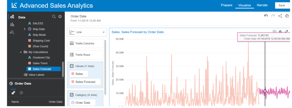
- Drag and drop Sales, Sales Forecast measure and Order Date into Visualization
- Choose the Line chart type
- Filter Order Date for data of 2015
Let’s compare this calculation with the prebuilt Forecast function supported automatically.
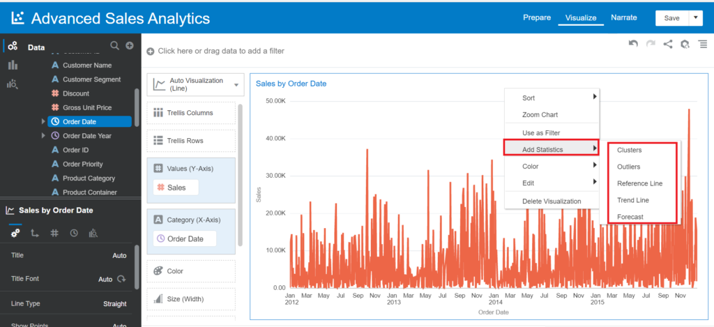
- Drag and drop Sales measure and Order Date into Visualization
- Choose the Line chart type
- Right-click on the visual > Add statistics > Forecast
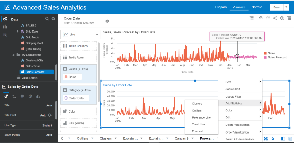
Make sure you choose the ARIMA model and Periods 90 days for Analytics of this visual.
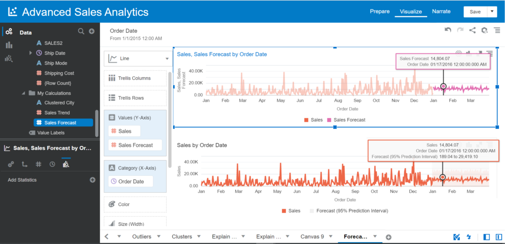
Now, let’s observe the Forecast line on this visual and compare it to the visual created before.
Creating the Cluster Function
The Cluster function groups a set of records into groups based on one or more input expressions using K-Means or Hierarchical Clustering.
Syntax:
CLUSTER((dimension_expr1 , ... dimension_exprN), (expr1, ... exprN), output_column_name, options, [runtime_binded_options])- dimension_expr represents the list of dimensions, e.g., (productID, companyID), to be clustered.
- expr represents the list of dimension attributes or measures to be used to cluster the dimension_expr.
- output_column_name is the output column. The valid values are ‘clusterId’, ‘clusterName’, ‘clusterDescription’, ‘clusterSize’, ‘distanceFromCenter’, ‘centers’.
- options mean the string list of name=value pairs separated by ‘;’. The value can include %1 … %N, specified using runtime_binded_options.
- runtime_binded_options is an optional comma-separated list of run-time binded columns or literal expressions.
Example:
CLUSTER((product, company), (billed_quantity, revenue), 'clusterName', 'algorithm=k-means;numClusters=%1;maxIter=%2;useRandomSeed=FALSE;enablePartitioning=TRUE', 5, 10)Let’s proceed to practice. Add a new calculation and enter the name Clustered City. This calculation has to group the list of cities by Profit and Sales and split into 4 groups.
Enter the expression:
CLUSTER((City), (Profit,Sales), 'clusterName', 'algorithm=k-means;numberClusters=4;maxlter=10;')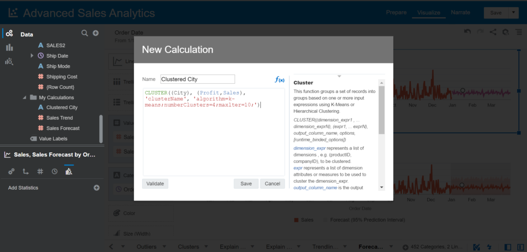
- Drag and drop City, Profit, and Sales into Visualization
- Choose the Scatter chart type
- Drag and drop Clustered City into Color
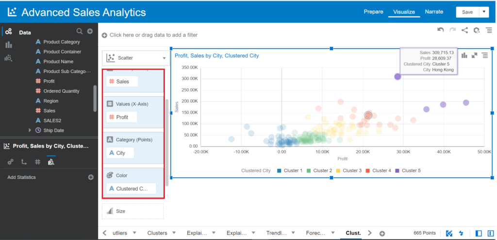
Now, you can create a new visual, use the Clusters function supported directly, and compare it to the customized Cluster function.
Conclusion
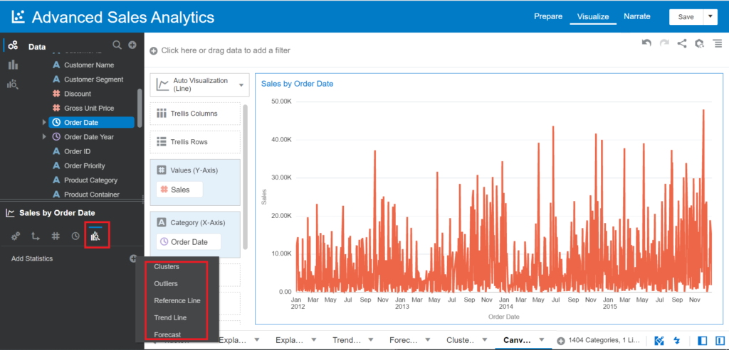
The Advanced Analytics capabilities in Oracle Data Analytics can be added to charts/visuals in different ways.
Right-click on the charts/visuals > choose Add Statistics.
Go to the left-bottom Chart Properties panel:
Build your functions by using Expression Builder within Trendline, Forecast, Cluster, Outlier, and other functions. This option allows you to customize the values of parameters of each Advanced Analytics function, as we’ve explored just a few examples of many parameters.
Tags: advanced analytics, express builder, oracle analytics Last modified: September 22, 2022