Microsoft’s Power BI is a data analytics tool that can be used for interactive data visualization, using data from various sources such as relational and NoSQL databases, flat files, web servers, etc.
Power BI visualizations are easy to plot and come with a variety of formatting options. Power BI comes in two flavors: Power BI Desktop and Power BI Service, which is a cloud-based Power BI Interface. See this article on Power BI licenses for more details.
In this article, you will learn how to plot Power BI Desktop visualizations and how to format them.
You will study the following formatting options:
- Changing Graph Colors
- Adding or Removing Legends, Titles, X-Axis, Y-Axis, and Data Labels
- Changing Size and Positions of Legends, Titles, Labels, etc.
- Changing Axis from Numerical to Categorical
- Showing Labels on Columns
- Changing Background Colors
- Aligning and Making the Charts Equidistant
Note: You can download Power BI Desktop using this link.
Creating a Power BI Desktop Visualization
Before you apply formatting to a Power BI Desktop Visualization, you have to create a visualization.
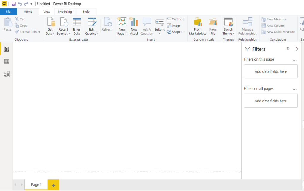
Once you run the Power BI Desktop application on your computer, you should see the following dashboard. The first thing you need to do is to import the dataset.
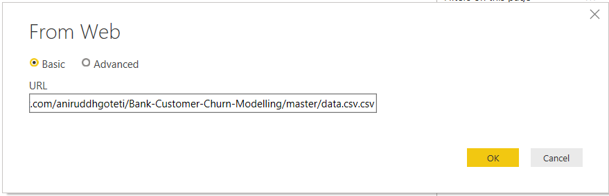
On the above dashboard, click on the “Get Data” tab from the top menu. In the dropdown list that appears, click on “Web”. You should see the following dialogue. In the URL field, enter the following URL: https://raw.githubusercontent.com/aniruddhgoteti/Bank-Customer-Churn-Modelling/master/data.csv.csv. Click the “OK” button.
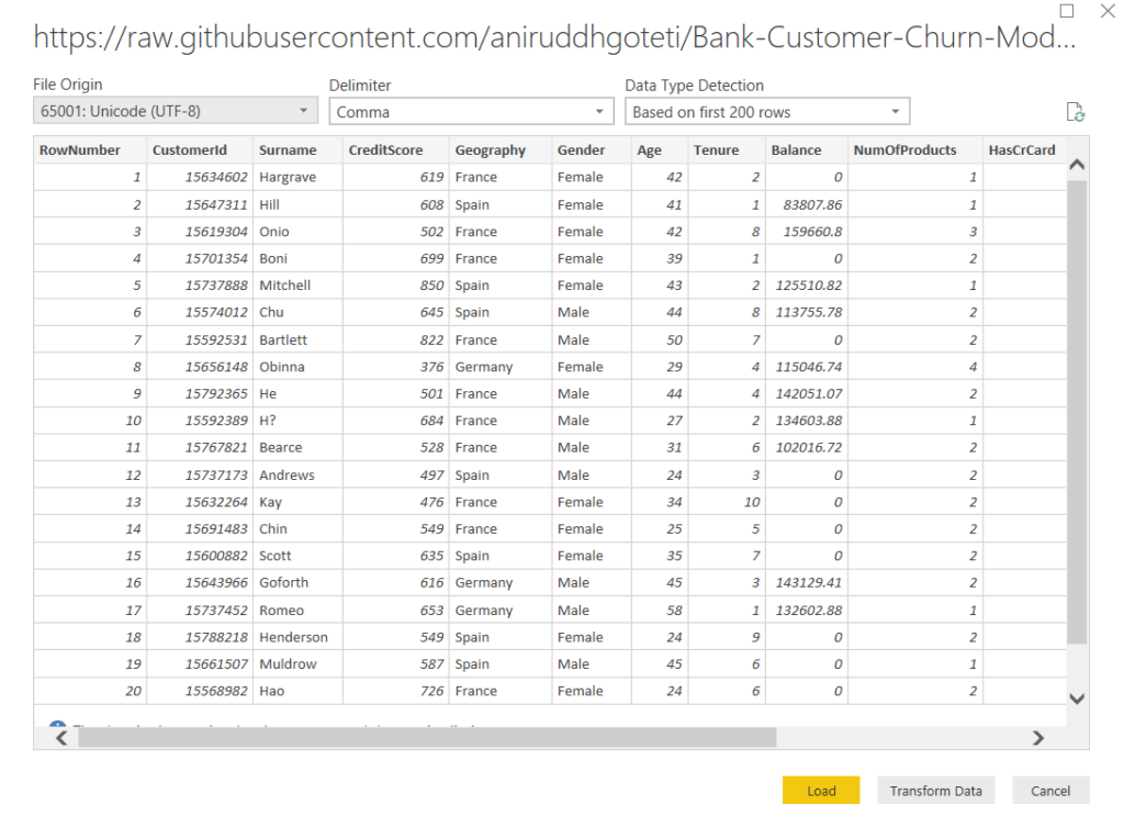
You will see the following window. Here you can see some of the columns in the dataset. You can scroll horizontally to see the remaining columns. The dataset basically contains information about bank customers.
The data for the “Exited” column of the dataset was recorded 6 months after the data had been recorded for the rest of the columns. The “Exited” column basically shows the information based on customers from 6 months ago, regardless of whether or not the customers left the bank 6 months after that. A value of 1 in the “Exited” corresponds to the case where the customer left the bank, while “0” belongs to the customers who stayed.
Click the “Load” button to load the data into your Power BI application without manipulating the data.
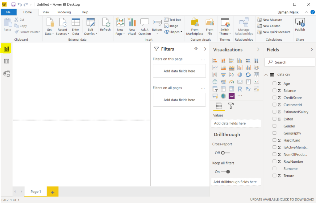
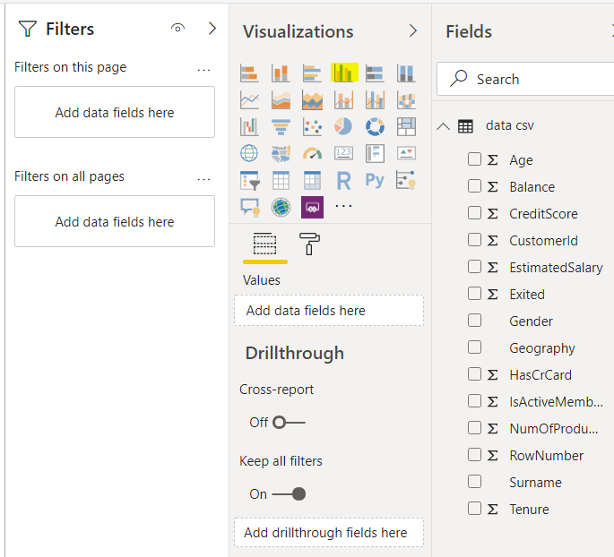
You should see the following window. Here, on the right side, you can see a pane named “Fields” where you can see all your column names.
On the extreme left, you can see three options. The option at the top, which is highlighted in yellow, is named “Report” and is used to open reports view. Click on it.
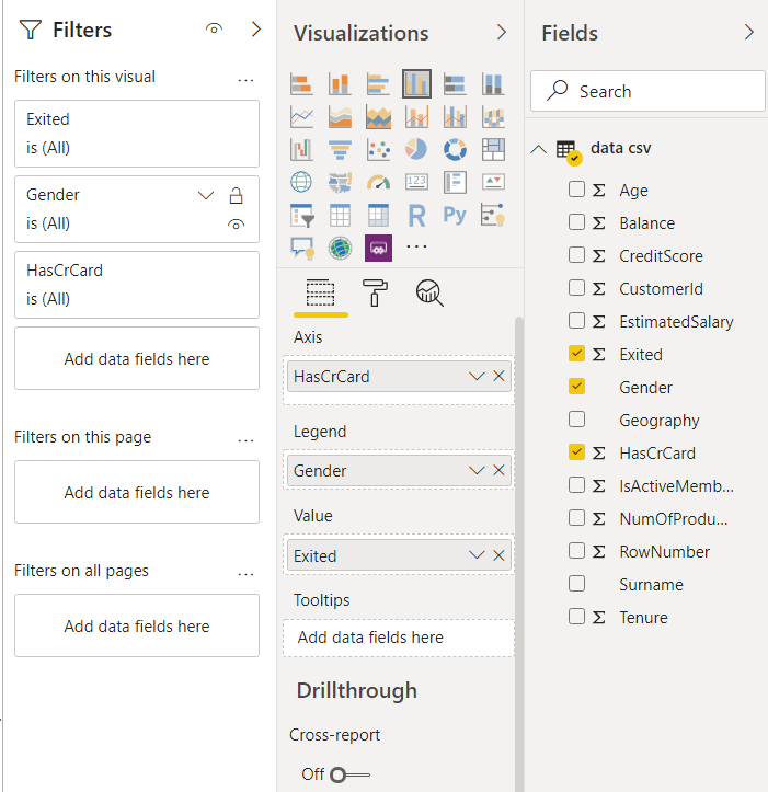
To create a new visualization, you have to select a visualization from the “Visualizations” window, as shown in the following screen. For the sake of this article, we will create a “Clustered column chart”, a “Pie chart”, and a “Donut chart”. First, click the “Clustered column chart”, which is highlighted in the following screenshot.
Next, drag the “Exited” column from fields into the Value field. For the Legend field, drag and add the “Gender” column. Finally, for the Axis field, add “HasCrCard”, as shown in the following screenshot.
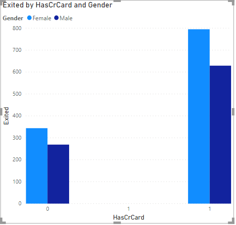
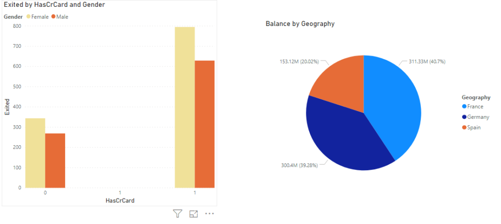
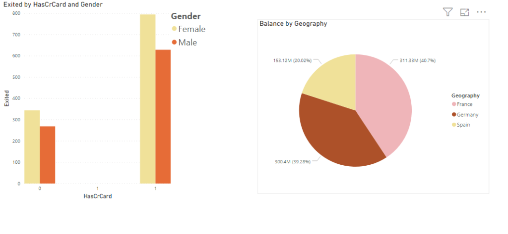
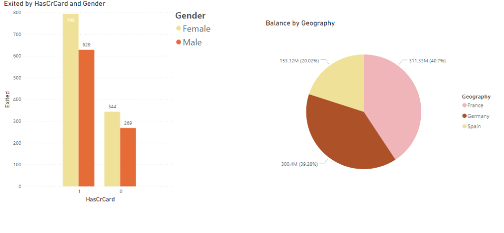
You should see the following graph created in the Report view. The plot contains columns that show the total count for the male and female customers who exited and who stayed in the bank. The columns are further grouped into two parts: those with credit cards and those without credit cards.
From the following graph, you can see that for both customers with and without credit cards, the number of female customers who left the bank is larger compared to male customers.
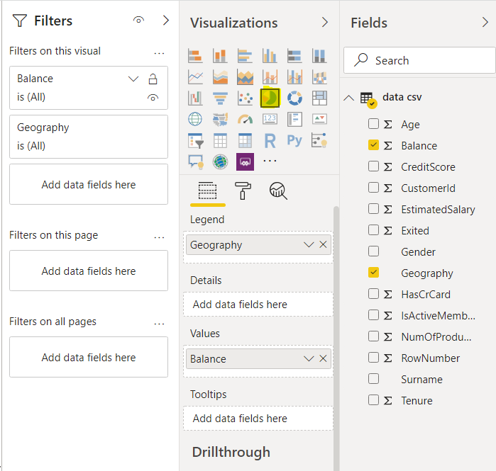
Let’s add another plot. This time, a pie chart. Click on the “Pie chart” option from the visualizations. Add a “Balance” column to the Values field, and a “Geography” column to the “Legend” field. You will see a “Pie” chart that shows the total balance of the customers belonging to different geographical locations.
Now you should see the two following visualizations in the reports window.
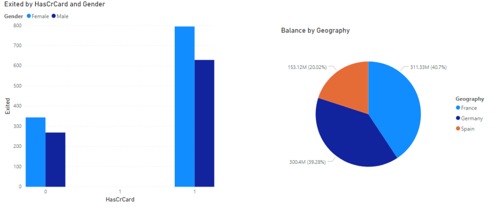
If you click on the area for the French customer in the Pie chart (the one defined by yellow square), the column chart is updated to highlight the values only for the French customer. The rest of the chart is made semi-transparent.
Formatting Power BI Desktop Visualizations
We created Power BI desktop visualizations in the previous section. Let’s now see how to format them.
To open formatting options, click on the graph that you want to format. Below the Visualizations options, you should see three options. The option in the middle, which is highlighted in yellow in the following screenshot, is the “Format” option. Click on it.
You should see formatting options that appear as shown in the following screenshot.
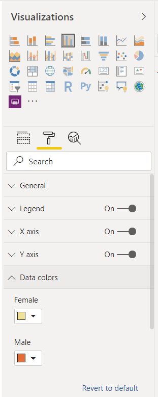
Changing Colors
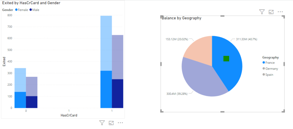
Let’s first change the color of the clustered column chart. Click the chart and then click the “Format” option. Next, click “Data colors”. Since you only have two types of column charts, one for male and one for female, you will see two color boxes: one for each column type, as shown below.
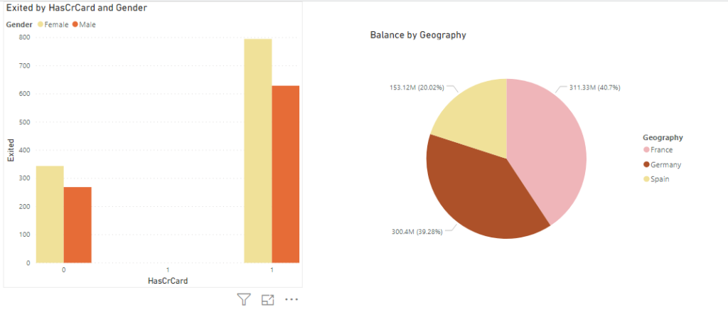
Change the color as per your liking. The following figure shows the updated colors for the clustered column chart.
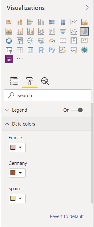
In the same way, you can change colors for the Pie chart, as shown below.
The following figure shows the updated clustered column, and pie charts.
Modifying Legends, Titles, X-Axis, Y-Axis, and Data Labels
You can make a legend appear and disappear. For example, click on the clustered column chart, then click the “Format” option. Turn off the radio buttons for “Legend”, “X-axis”, and “Y-axis’ fields.
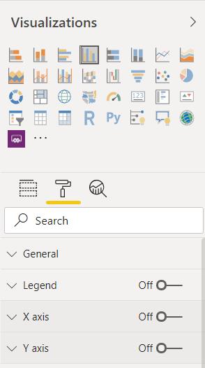
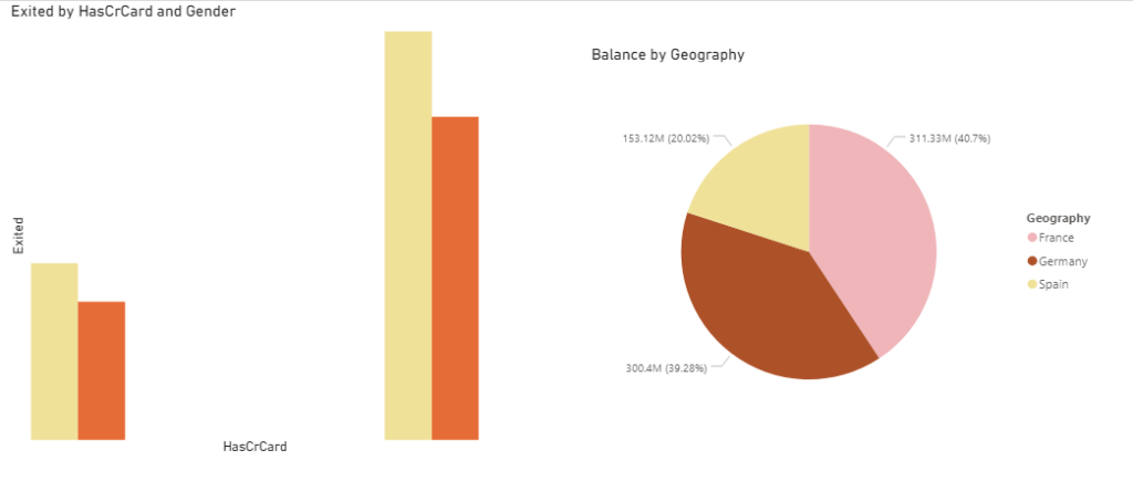
In the output below, you can see that the Legend, X-axis, and Y-axis information has been removed from the column clustered chart.
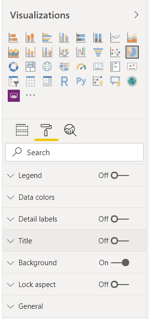
In the same way, you can remove “Legend, Detail Labels, Title” from the Pie chart as shown below. It is important to mention that depending upon the graph, the formatting options are different. For instance, the options to modify X and Y axes are not available for Pie charts.
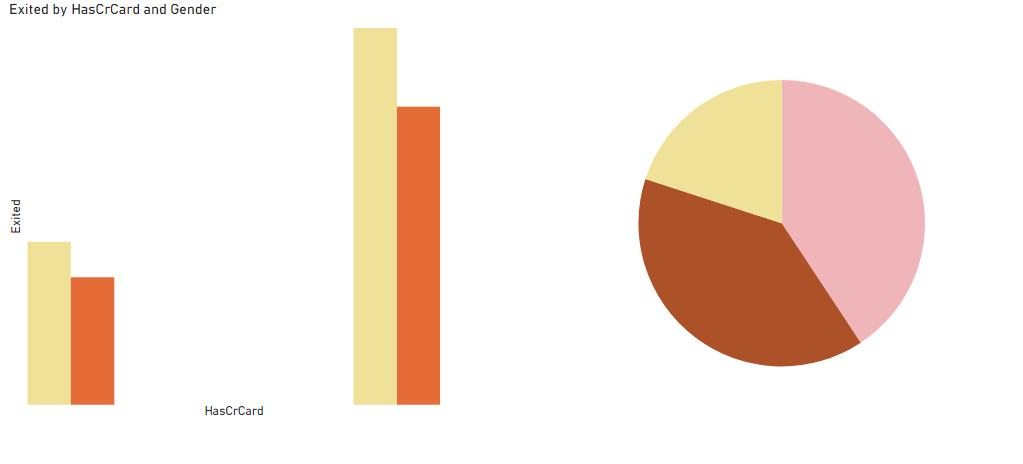
In the output below, you can see that legend, data label, and title is removed from Pie chart as well.
Make the legends, titles, data labels, X and Y axes appear before proceeding further.
Changing Size and Positions of Legends, Titles, Labels, etc.
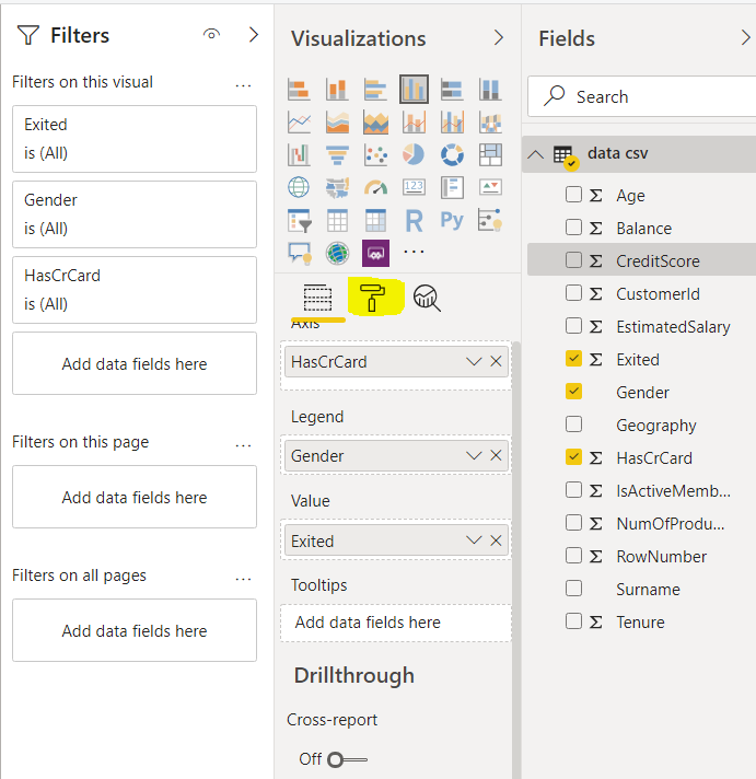
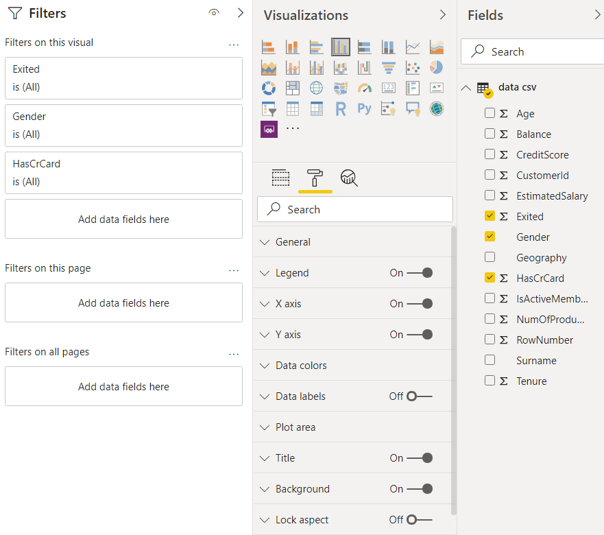
You can also change the size, locations, fonts, etc. for the different chart properties such as legends, labels, titles, etc. For instance, click the clustered column chart and open the formatting window. Click the “Legend” field where you should see different options such as Position, Legend Name, Color, Font Family, Text Size as shown in the following screenshot.
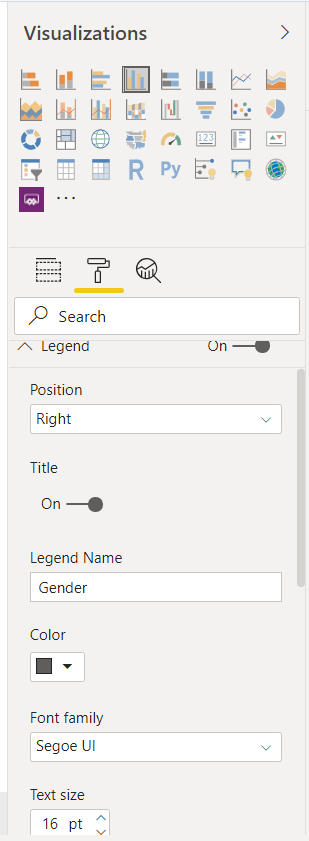
In the above window, the Position is set to Right, and Text Size is set to 16. Below is the output screenshot. Here you can see that the legend for the clustered column is now on the right side which was originally on the top. Furthermore, the font size for the label has also increased.
Changing Axis from Numerical to Categorical
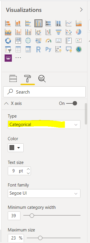
If you have numeric data in the column that you used to display in X-axis for the clustered column chart, the data is by default treated as numeric. To convert the numeric data to categorical, go to the “Format” option, click the “X axis -> Type” field and select “Categorical” from the dropdown list as shown below:
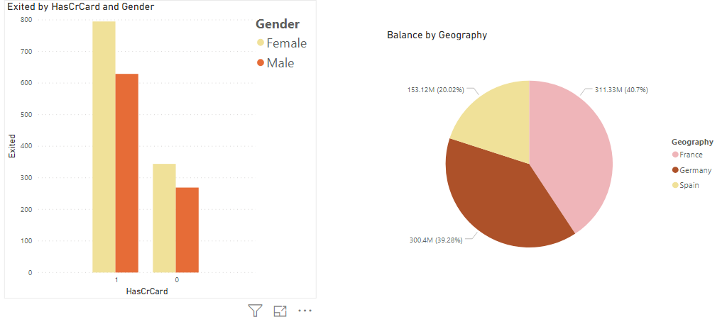
Now you can see in the following screenshot, that 1 and 0 in the “HasCrCard” column are treated as categorical values and the distance between the columns in the clustered column chart has reduced.
Showing Labels on Columns
You can also show values for the columns in the clustered column chart. To do so, go to formatting options and drag the radio button for the “Data labels” field to the right i.e. “On”.
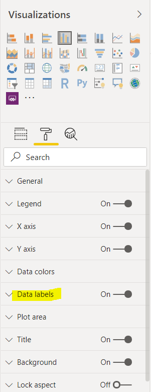
Now you can see values on the column charts as shown below:
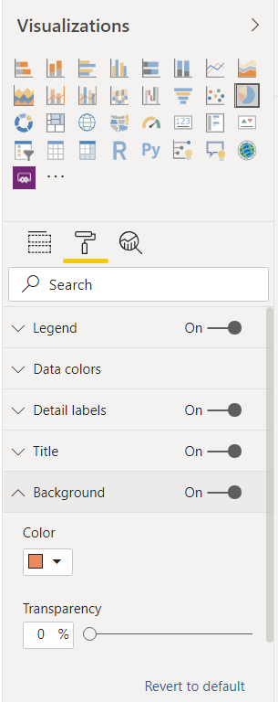
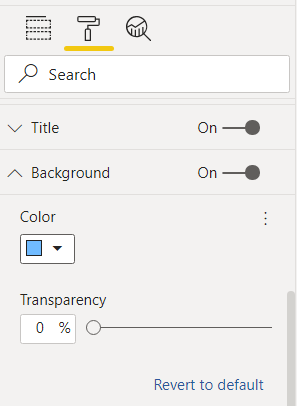
Changing Background Colors
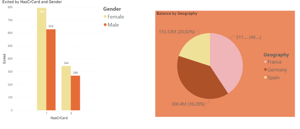
It is very easy to change background colors for the columns. You have to go to the formatting options, select the “Background” field, and then select the color that you want to set to the background. The following screenshot updates the background color for the Pie chart.
Here is the output:
In the same way, you can change the background color of the clustered column chart to “sky blue” as shown below:
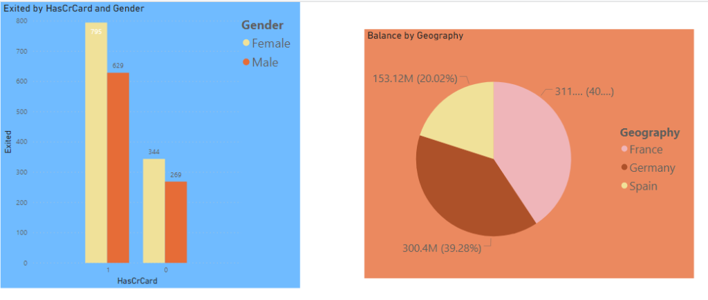
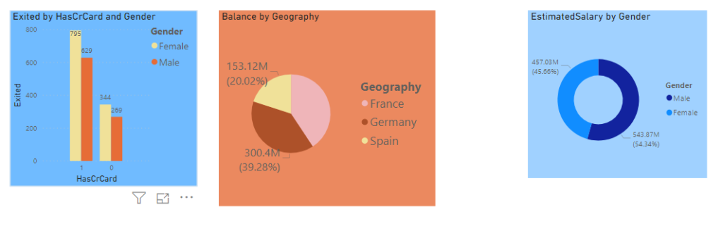
In the following output, you can see the background colors for both clustered and pie charts.
Aligning and Making the Charts Equidistant
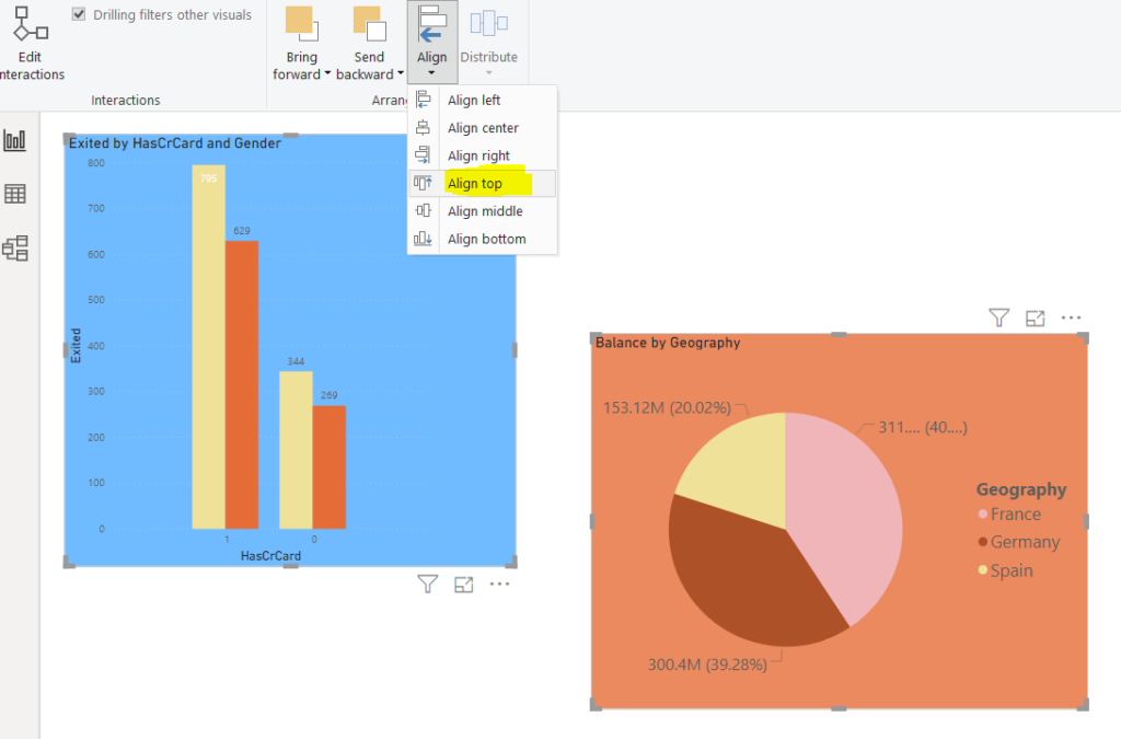
You can align the charts in reports. To do so, select the charts that you want to align and then click the “Align” option from the top menu. A dropdown menu will appear; select the type of alignment that you want to apply. For instance, in the following image, the two charts are being top aligned.
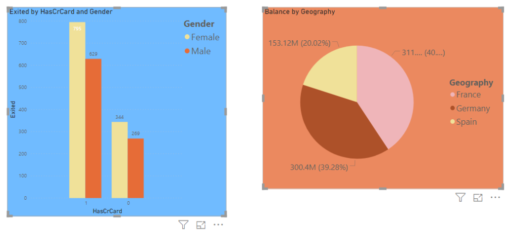
Here is how the charts look after alignment.
Here is how the charts look after alignment.
You can also organize the charts in the reports view so that they have an equal distance between one another. Let’s add a “Donut” chart to the visualization. Our visualization looks like this now. You can see that the first two charts are closer to each other compared to the Donut chart.
To make the charts equidistant, click the three charts, then click on the “Distribute” button from the top menu, and then click “Distribute horizontally” from the dropdown menu as shown in the following screenshot.
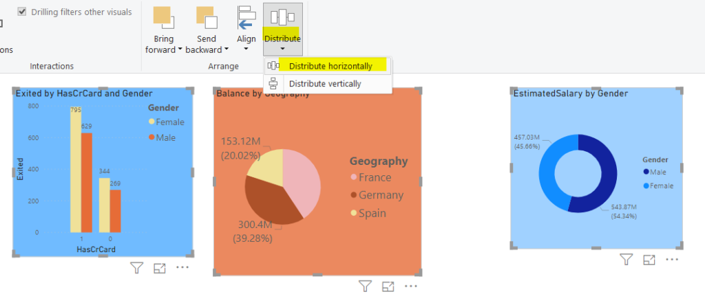
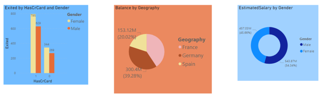
After you distribute the charts horizontally, you will see that all the charts have equal distances between them. Here is the output:
Conclusion
This article shows how to apply different types of formatting to Power BI Desktop visualization. The article explains how to add, remove, resize, and change positions of labels, legends, and titles. The article also explains how to change the front and background colors of the plots. Finally, the process of aligning and adding equal distances between different plots has been explained.
Tags: data formatting, power bi, power bi reports, visualization Last modified: September 20, 2021