
Power BI is a data analytics and interpretation tool developed by Microsoft. With Power BI, you can create various types of static and interactive visualizations.
In this article, you will see how to use the Power BI Slicer tool to add interactivity to your visualizations. With Power BI slicer, you can filter data presented on your visualization at run time, based on specific criteria.
Table of Contents
- What is Power BI?
- Import Test Data to the Power BI Report
- Types of Slicers in Power BI
- How to Create Numeric Range Slicer in Power BI
- How to Create Categorical Columns Slicer in Power BI
- Conclusion
What is Power BI?
Power BI is a powerful data visualization software that allows users to easily analyze their data. It works on the premise of visualizing data, which means it can be used to create reports that are easy to understand and share. There are many reasons why you may need to use this type of software.
For example, if you run a company that sells products online, then you might find yourself having to deal with a large amount of data. If you want to see how much money you made last year, but don’t want to spend hours looking over the numbers, then you can use this tool to quickly pull up all of your relevant information. In addition, this software is able to connect with a variety of different databases, allowing you to take advantage of new insights.
Import Test Data to the Power BI Report
To create a Power BI visualization, you need data. Power BI allows you to import data from various sources such as flat files, databases, web services, etc. The dataset that you will be using to plot visualizations in this chapter can be downloaded freely in the CSV file via this Kaggle link.
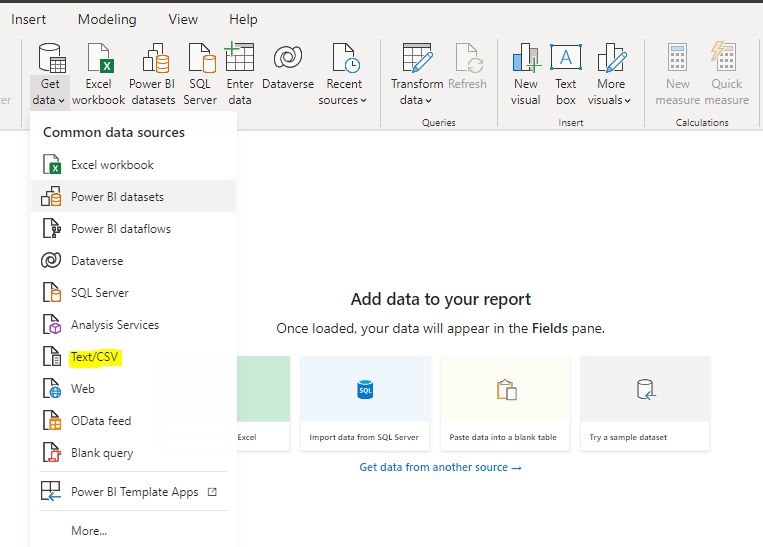
Next, from the top menu in the Power BI dashboard, click the Get data option. A dropdown list will appear, select Text/CSV from the list. Look at the following screenshot for reference.
A file upload dialogue box will open, browse to the location where you downloaded your CSV file, and open it. You will see the following window. Click the Load button to load the data to Power BI reports view.
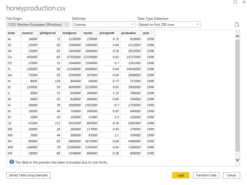
The dataset contains information about honey production in different US states from the year 1998 to 2012. The data contains the state name, number of bee colonies, yield per bee colony, total production, price per pound, etc.
Types of Slicers in Power BI
There are five types of Power BI Slicers available for use in your workflows:
- Numeric Range Slicer
- Date Slicer or Date Range Slicer
- Hierarchy Slicer
- Sync-based Slicer
- Resizable Slicer
How to Create Numeric Range Slicer in Power BI
In this section, you will see how a Power BI slicer allows you to slice or filter data based on values in a numeric column at runtime which consequently updates corresponding visualizations.
Let’s plot a simple clustered column chart that displays the yearly sum of bee colonies for all the US states from the year 1998 to 2012.
Step 1. Create a clustered column chart
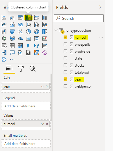
To create a clustered column chart, select the Clustered Column Chart option from the visualization pane of the Power BI reports view. In the Axis field, add a year column from the Fields pane. And in the Values column, add a numcol (number of bee colonies) column from the Fields pane. Here is a screenshot for your reference.
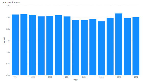
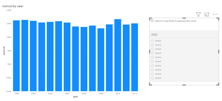
You will see the following clustered column chart in your Power BI reports view. The X-axis represents years while the bars represent the sum of bee colonies in all US states for the corresponding years.
Let’s see how you can add a Power BI slicer to filter records in the above clustered column chart at runtime.
Step 2. Add Slicer
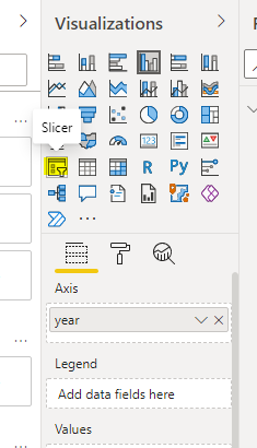
To add a slicer, select the Slicer option from the Visualizations pane in your Power BI reports view. Look at the following image.
Once a slicer is added, you will see that both the clustered column chart and your slicer are visible in the reports view. It is important to notice that you see different sizes and positions for your clustered column chart. I have resized and repositioned them for my convenience. You are free to change the sizes and positions as you wish.
Step 3. Choose column name for slicing
The next step is extremely important. On your slicer, you need to specify the column name that you want to use to slice the data. Let’s see how you can do that.
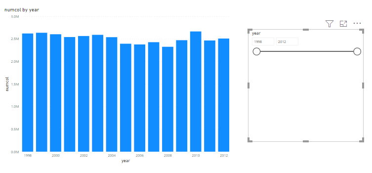
Your clustered column chart uses the year and numcol columns to display a bar plot. Suppose, you want to slice or filter records based on the year field. In that case, you will drag the year field from the Fields pane and drop it on your slicer. Once you do that your slicer will look like the one in the following image.
In the image below, you can see that the slicer pane contains two text fields and a data range field. To filter records, you can either specify the values in the text field or move the range widget.
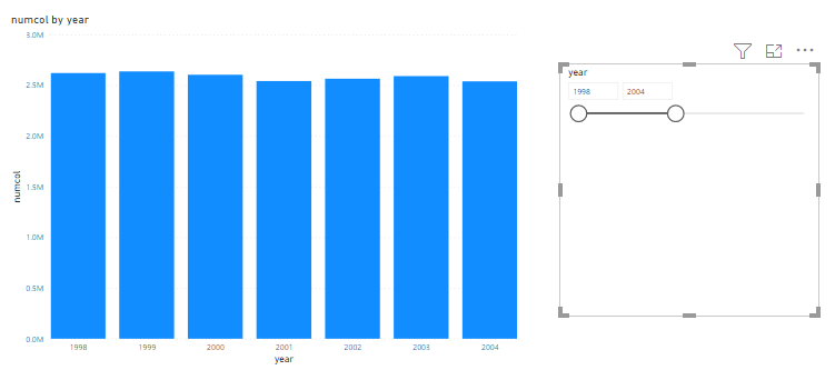
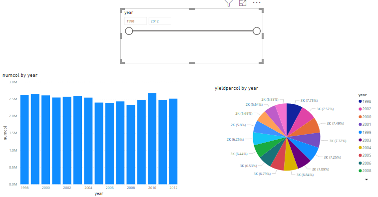
Let’s filter records by dragging the data range widget back to the year 2004 as shown in the following image. You can see from the following screenshot that the clustered column chart is updated at the runtime. You can play around with the year values and see how your clustered column chart is dynamically updated.
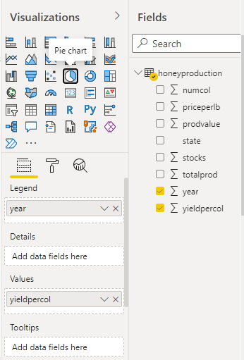
You can use a slicer to simultaneously update multiple visualizations. Let’s see an example. Add a pie chart to your reports view that already contains your clustered column chart and your slicer.
Step 4. Add additional visualization
To do so, select the Pie chart option from the Visualizations pane. In the Legend field, add a year column. And in the Values field add the yieldpercol column. The pie chart will show the sum of honey yields per colonies values for all the US states from the year 1998 to 2012. Look at the screenshot below for reference.
As a result, now you can see a slicer, a clustered column chart and a pie chart in your reports view as shown in the following screenshot.
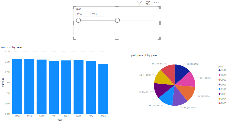
To see the effect of slicing on both of the charts, drag the range of years from 2012 back to 2005. As a result, you will see that both charts will be updated and will display results only for the years 1998 to 2005.
How to Create Categorical Columns Slicer in Power BI
In this section, you will see how Power BI Slicer filters data at runtime using a categorical column. The dataset that you will be using in this section can be downloaded via this kaggle link. Download the CSV file and import it to your Power BI dashboard as you did in the previous section.
The dataset contains information about the passengers who traveled on the unfortunate Titanic ship that sank in 1912.
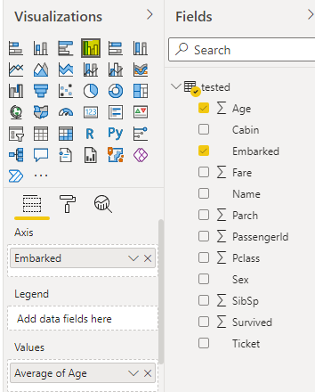
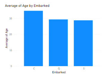
Let’s plot a clustered column chart that shows the average ages of passengers against the cities from where they embarked on the Titanic. Look at the following screenshot for reference on how to plot such a clustered column chart. You need to specify the Embarked column as a value for the Axis field and Average of Age as the value for the Values field.
You should see the following clustered column chart in your reports view.
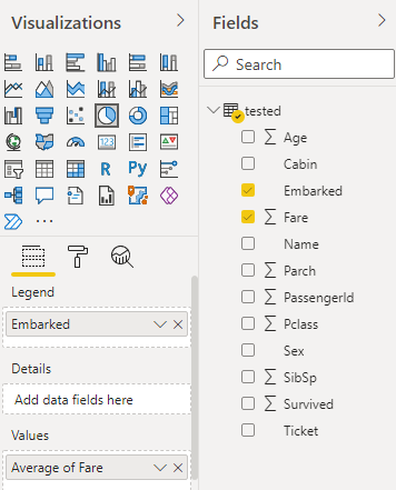
Let’s add a pie chart that shows the average fare paid by passengers who embarked from different towns. Here is a screenshot of how to do it using the Visualizations pane. You can see that the Legend field contains the Embarked column whereas the Values field contains an average fare.
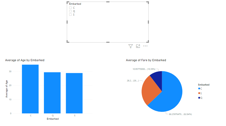
Finally, you can add a Power BI slicer on your reports view dashboard. You will be filtering charts based on the Embarked column, therefore drag the Embarked column from the Fields pane and drop it to your Power BI slicer.
Your reports view should now look like this. You can see a clustered column chart, a pie chart, and a slicer. Notice that since the Embarked column is a categorical one, you can see three checkboxes. By default, the charts display information based on all the three embarked towns as shown below:
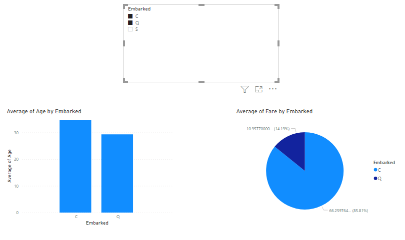
To filter the embarked towns, tick the checkbox for the corresponding towns and the reports view will update the charts automatically. For instance, in the following screenshot, you can see that the Power BI slicer specifies that only embarked towns C and Q should be displayed. Therefore, the corresponding information in the clustered column chart and the pie chart is updated.
Conclusion
In this article, I have explored such an efficient and helpful tool as a Power BI slicer. We have seen how to use it to add interactivity to visualizations based on certain criteria. You can further play around with the Power BI slicer using the other column types and see how you can filter records at runtime.
Tags: power bi features, power bi reports, visualization Last modified: October 27, 2022