For starters, Microsoft Power BI is one of the most commonly used data analytics and visualization tools. With its help, you can import and visualize data from various sources, such as text and CSV files, relational databases, web servers, etc. Power BI comes in two flavors: Desktop and Cloud-Based Service.
As a matter of fact, you can visualize hierarchical as well as flat data with Power BI. An example of hierarchical data would be records that contain region and country names or countries and city names, etc. In short, datasets, containing records where one or more columns are a subcategory of another column, are called hierarchical datasets.
In this article, you will learn how to visualize a hierarchical dataset using Power BI Visualizations.
Note: You can download Power BI Desktop using this link. For details on the differences between different Power BI licenses, reference this article.
Creating a Power BI Desktop Visualization
Let’s create a very simple Power BI Desktop visualization that shows countries and their total sum of GDP per capita. The dataset for this visualization is a CSV file that can be downloaded from this kaggle link. Download the CSV file into your local file system.
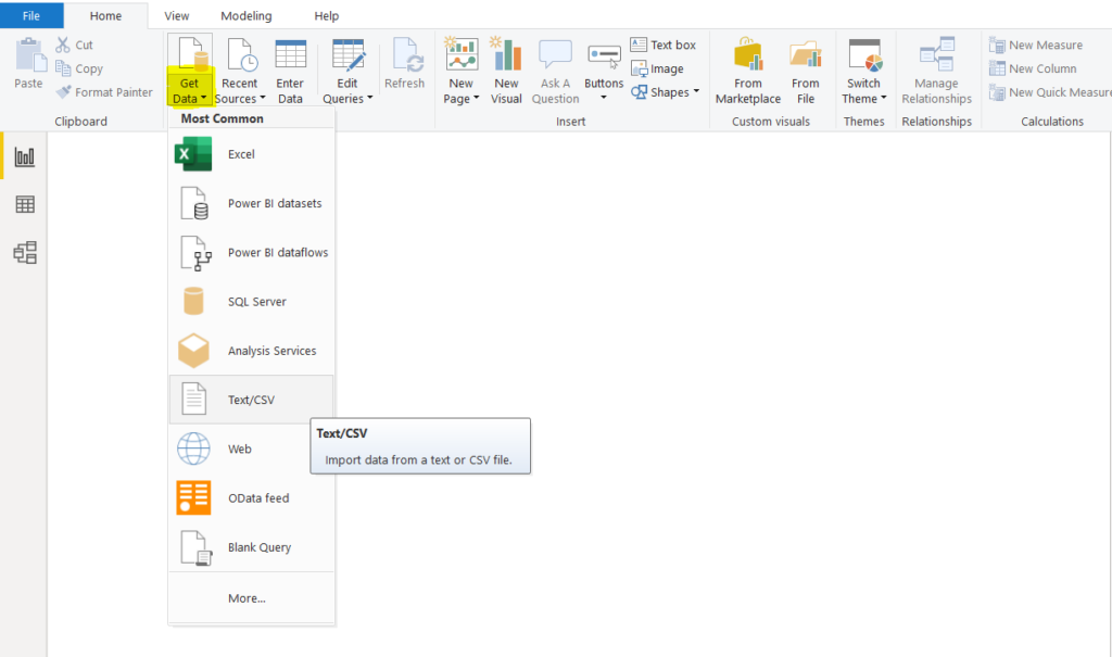
Next, open the Power BI Desktop, click on the “Get Data” button from the top menu. From the dropdown list, select “Text/CSV” as shown below.
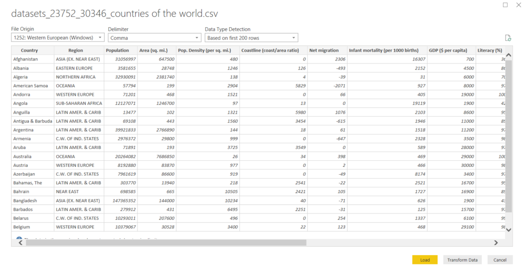
Browse to the location where you downloaded your CSV file for the dataset and upload the file. Once the file is uploaded, you will see the following Window. You can see that the dataset has a “Country” as well as a “Region” column. In a logical hierarchy, the values in the “Country” column come under the values in “Region”. For example, the country of Austria is in the region of Western Europe.
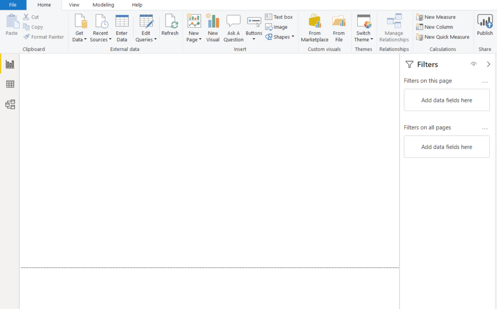
Click the “Load” button to load the dataset into your application. You will see an empty report view, as shown in the following screenshot.
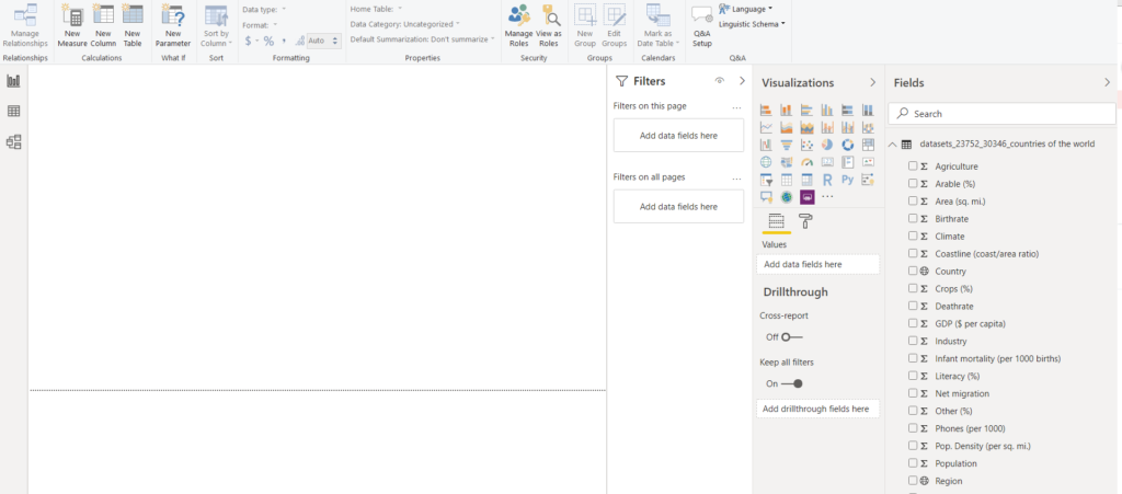
Changing Category Type of Country and Region Columns
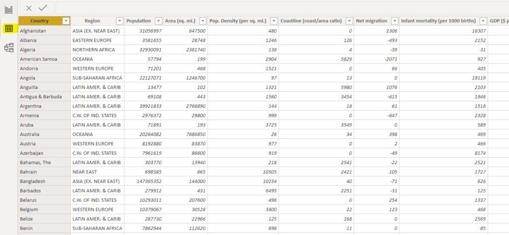
The first thing we need to do is change the category type of the “Country” and “Region” columns. By default, these columns are uncategorized.
From the three options presented vertically on the extreme left, click the second option, i.e., “Data”, as highlighted in the following screenshot.
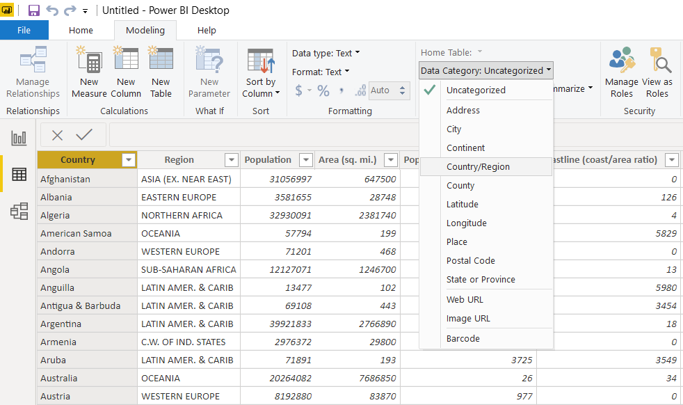
To change the category type for the “Country” column, select the “Modeling” options pane from the top menu and click on the “Data Category” dropdown list. From the dropdown list, select “Country/Region” as the category for the “Country” column. This is shown in the following screenshot.
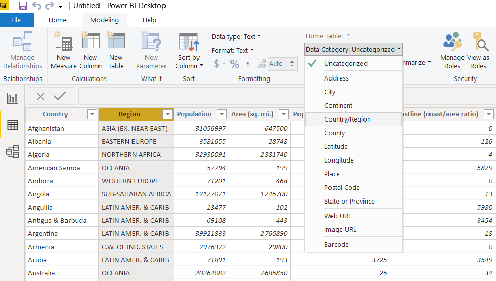
In the same way, you can change the data category for the “Region” column, as shown below:
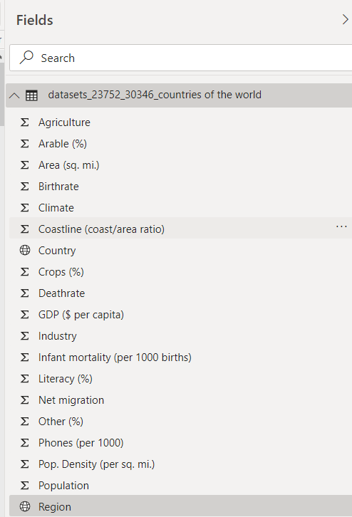
Now, if you look at the “Fields” on the right side, you should see a symbol of earth before the “Country” and “Region” columns, which show that these fields represent a country or a region.
Next, to go back to the Reports view, select the topmost option, i.e., “Report” from the three options presented vertically on the extreme left, as shown below:
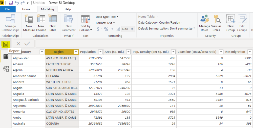
You should see the following report view.
Creating a Visualization Without Hierarchies
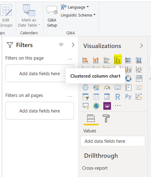
Let’s first create a simple visualization without any hierarchy. We will first see a clustered column chart that shows the countries and the sum of their GDP per capita. To do so, select “Clustered column chart” from the “Visualizations” window, as shown below:
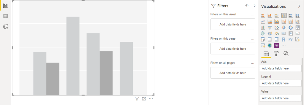
You should see an empty visualization, as shown below:
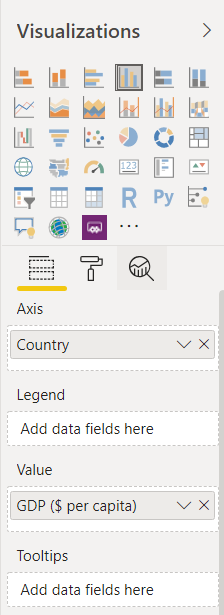
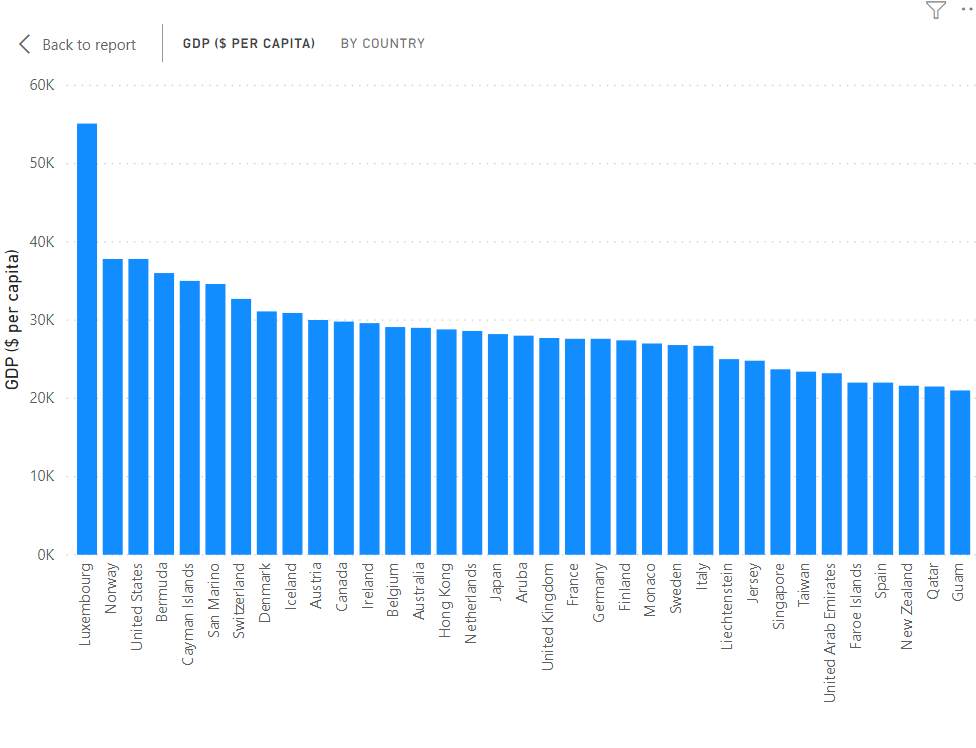
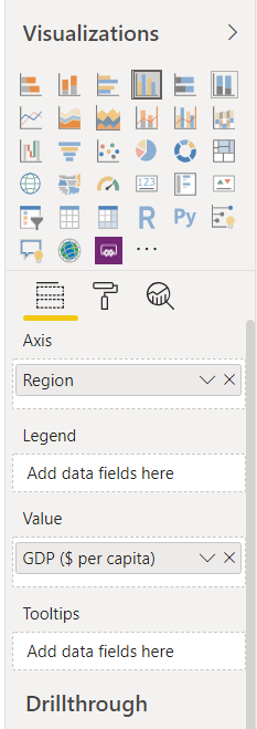
To add data to this visualization, drag the “Country” column from the “Fields” window and drop it to the “Axis” field. Similarly, drag the “GDP ($ per capita)” column from the “Fields” window and drop it in the “Value” field in the “Visualizations” window. Look at the following screenshot for reference.
You should see the following chart. You can see GDP per capita for all the countries in descending order from left to right. You can scroll the bar horizontally to see the values for all the countries.
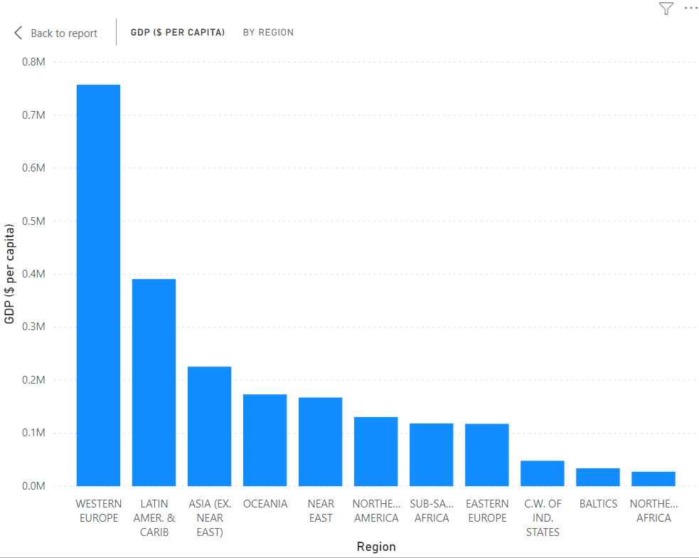
Let’s now plot the GDP per capita for the regions. To do so, replace the “Country” column in the “Axis” field by the “Region” column, as shown in the following screenshot.
The following chart will be created. You can see that sum of GDP per capita is highest for Western Europe, followed by Latin America and Asia.
In the previous two plots, the sum of GDP per capita is plotted separately for countries and regions. What if you want a single graph that shows the sum of GDP per capita for both regions and countries? This is where hierarchical Power BI Visualizations come into play
Creating Power BI Visualizations with Hierarchies
To are two ways to create Power BI Visualizations with Hierarchies: Automatic Hierarchies and Manual Hierarchies.
Automatic Hierarchies
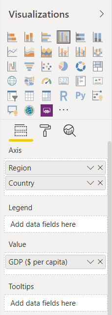
To create automatic hierarchies, all you have to do is mention the child column under the parent column in the Axis or Legends field, depending upon the graph. For instance, in the following screenshot, we create a clustered column chart. If you look at the Axis field, here at the top level, the field “Region” is mentioned. Below the “Region” field, you can see another field, which is “Country”. This creates an automatic hierarchy between the “Region” and the “Country” field, as shown below:
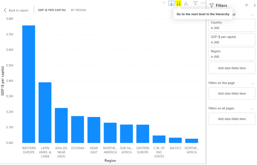
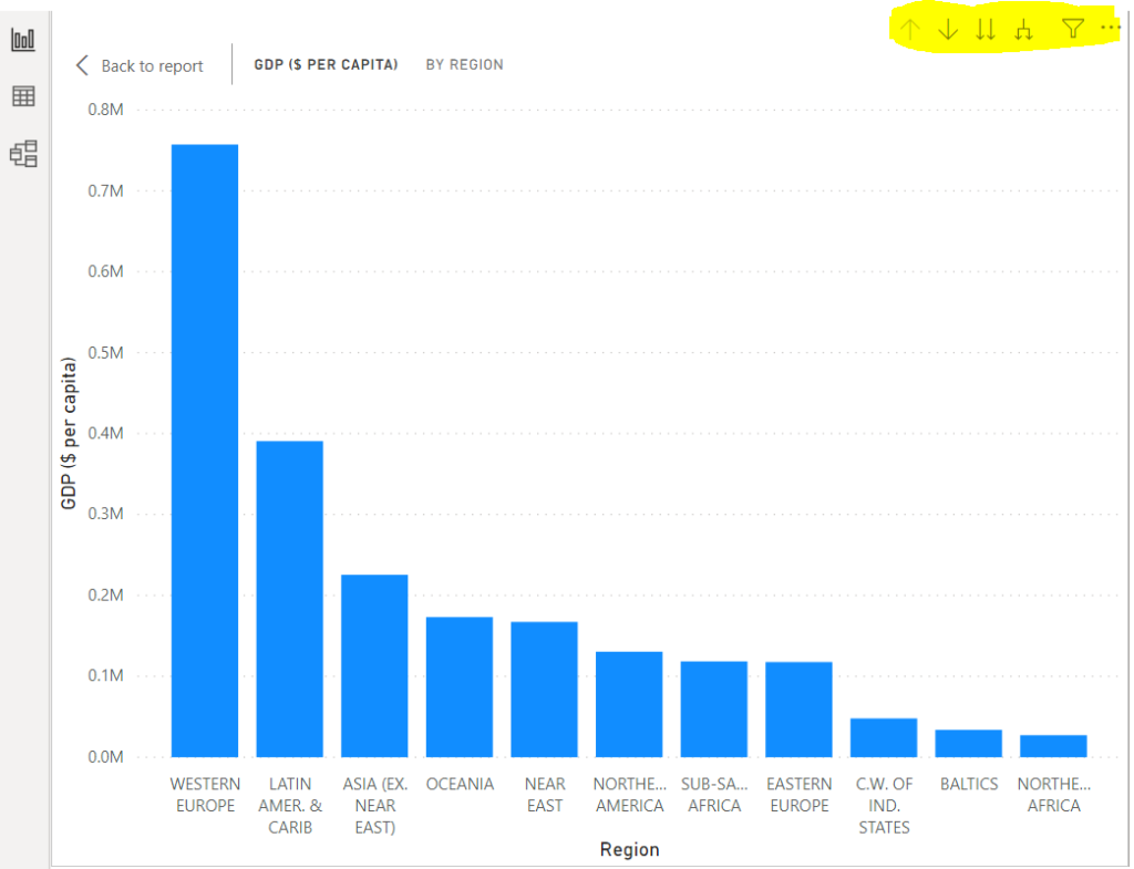
The following screenshot shows the output graph that will be created. In the top right corner of the graph, you can see some new options highlighted in yellow. These options only appear in graphs with a hierarchy. By default, the graph shows the data for the highest value in the hierarchy, i.e., region.

Click on the double downwards arrow button from the list of buttons at the top right, as shown in the following figure. This will take you to the next level of the hierarchy.
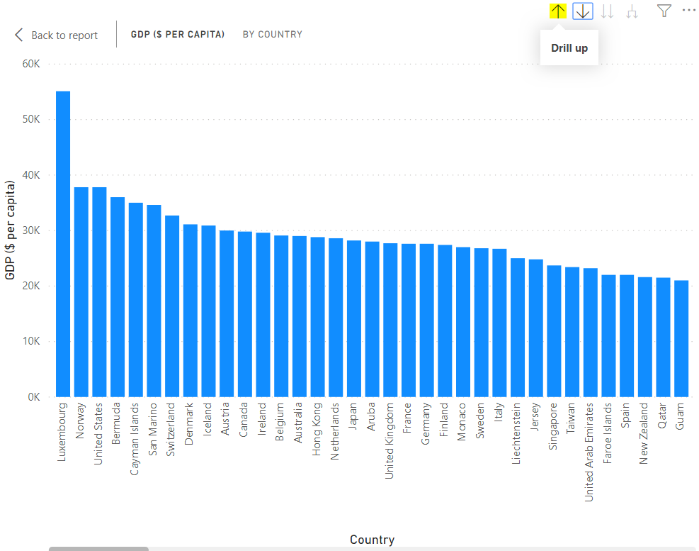
The next level of the hierarchy shows GDP per capita per country, as shown below. To move back up to the previous level of the hierarchy, simply click the “Drill up” button, as shown below.
Another extremely interesting option is the “Drill Through” option. To enable drill-through, you have to click the downward arrow, as shown in the following figure. With drill through, you can apply a filter while moving to the next level of the hierarchy. For instance, after enabling the drill-through functionality, if you click the column for the “WESTERN EUROPE”, you will see the GDP per capita for the countries in “WESTERN EUROPE” only.
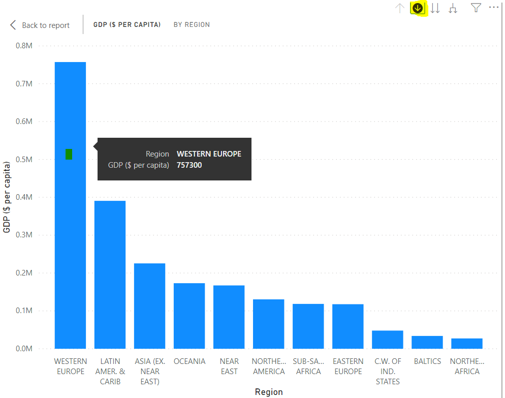
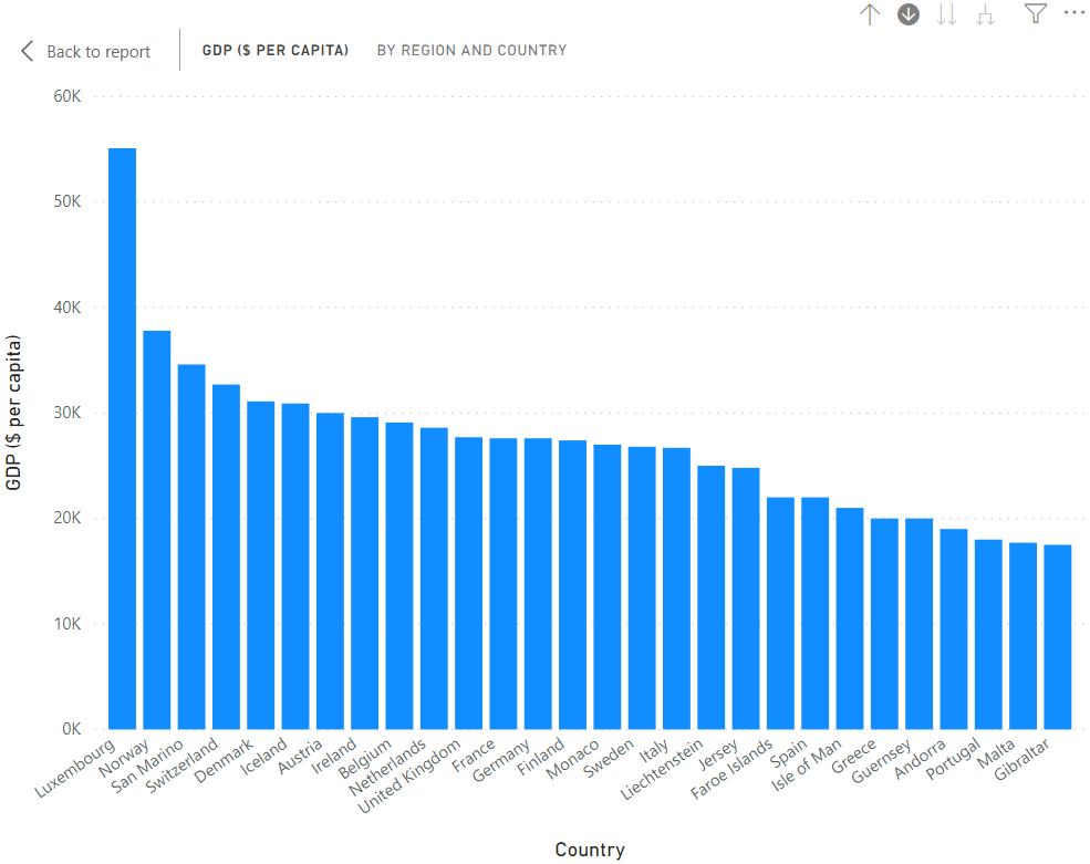
Here is the output. You can see that only western European countries are visible in the graph.
Creating Manual Hierarchies
In addition to automatic hierarchies, you can create manual hierarchies. To create a hierarchy “region->countries”, right-click the “Region” field and click “New hierarchy”. You will see that the “Region Hierarchy” will be created.
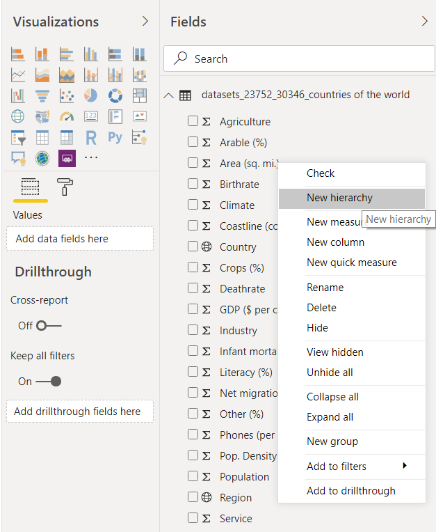
Next, drag the “Country” column from the list of fields, and drop it on the “Region Hierarchy”. This will create a new “Region Hierarchy”, as shown below:
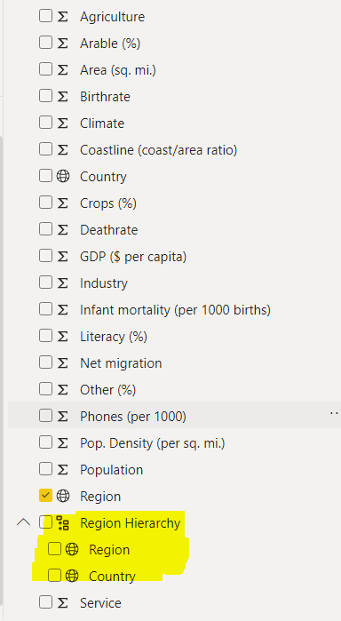
Now, you can drop this “Region Hierarchy” into the “Axis” field.
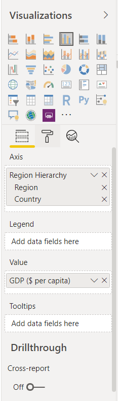
In the output, you will see a plot similar to the one you saw for automatic hierarchies. You can move down, move up, and drill through the graph, using the same options that you used for the automatic hierarchies.
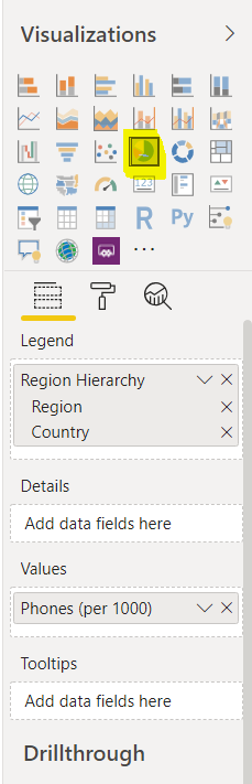
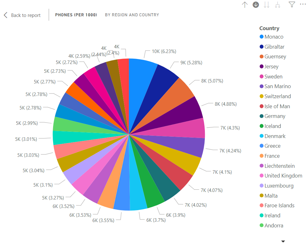
It is important to mention that hierarchies are not limited to the cluster column chart. You can create other charts with hierarchical information as well. For example, in the following screen sheet, a pie chart is being created with “Region Hierarchy” as a legend and “Phones (per 1000)” as a value for the pie chart.
Here is the pie chart that has been created. The pie chart shows the information about “Phones per (1000)” per region. Click the double downwards arrow option to go to the next level in the hierarchy.
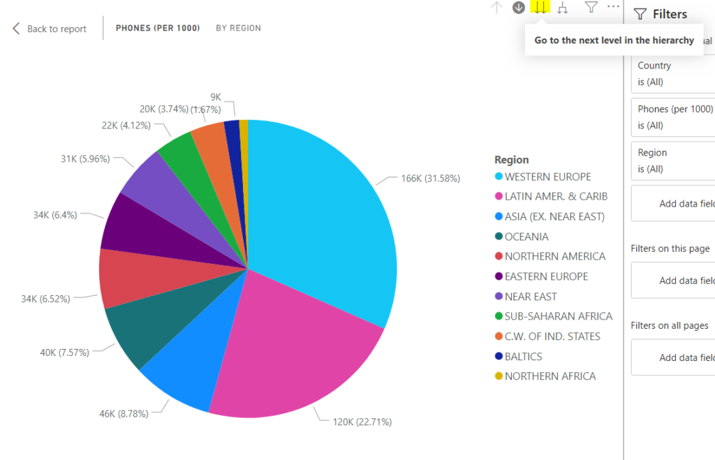
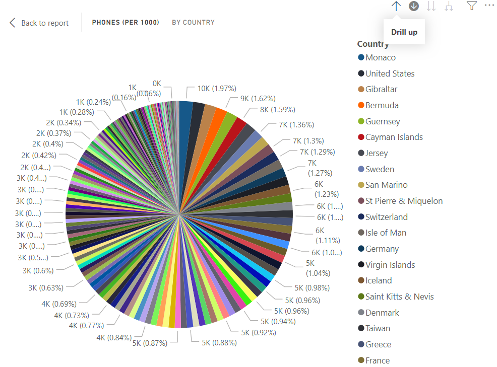
In the following output, you can see the information for “Phone per (1000)” for all the countries.
Similarly, if the drill through option is enabled, you can click on any region, and the countries belonging to that region will appear in the pie chart. For instance, in the following figure, we click on the area for western Europe.
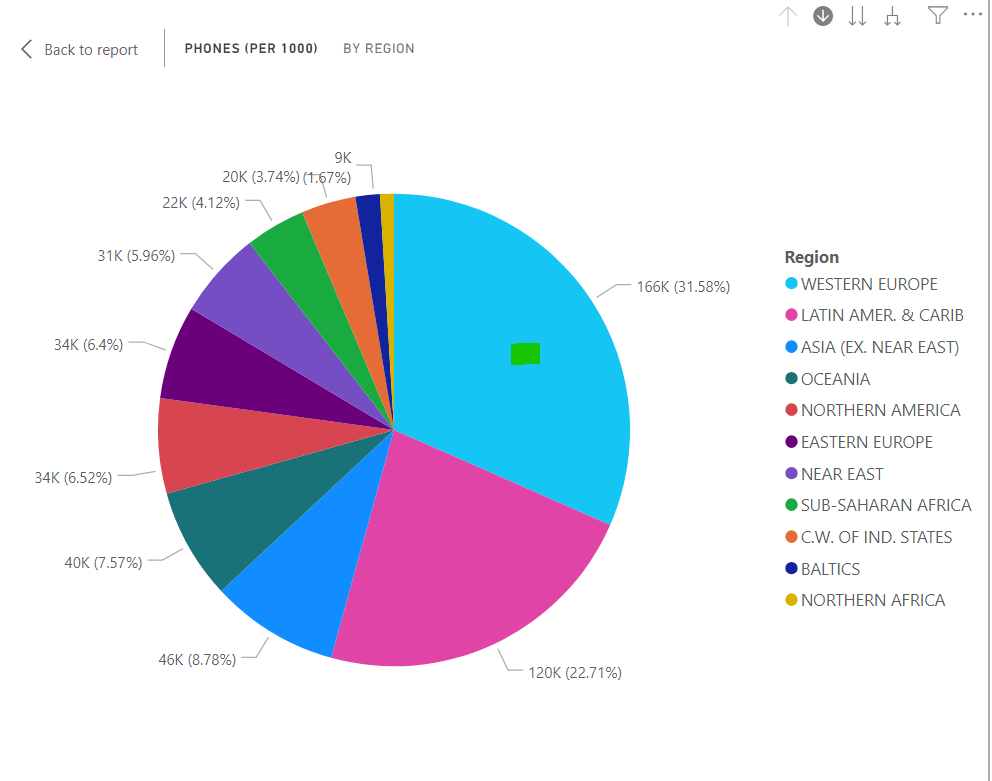
In the output, you will get the information for “Phone per (1000)” for the western European countries only.
Conclusion
To sum up, this article explains how to visualize hierarchical data using Power BI Desktop visualizations. On the whole, there are two ways to implement hierarchies in Power BI. You can either implement hierarchies automatically or manually. With the help of hierarchies, you can move down, move up, and drill through hierarchical data.
Tags: power bi, power bi reports, visualization Last modified: September 20, 2021