Microsoft Power BI is a data visualization and analytics tool which lets you create powerful visualizations with a graphical user interface. It can use a variety of data sources such as CSV, TSV, and other flat files, SQL databases, and even online sources through Rest APIs.
This article explains the usage of Rest API as a data source to import JSON data in Power BI from a remote location. Also, we’ll learn how to transform the imported JSON data into a tabular format. Finally, we’ll plot visualizations using the imported data.
Let’s start.
Power BI Data Sources
The data you will import via REST API calls is available for free at https://jsonplaceholder.typicode.com/
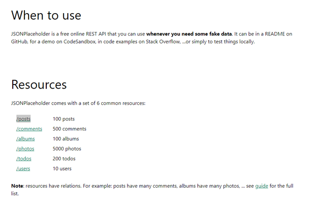
The dataset consists of fictional posts by 10 users. There are 500 comments on each post. Also, there are some fictional photos, to-dos, and albums. We can access the dataset via Rest API calls.
If you scroll down the webpage, you will see the following information:
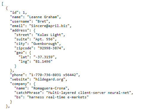
If you click users, you will see the JSON file containing data for users. The user object looks like this:
Import Data from Websites via Power BI REST API Calls
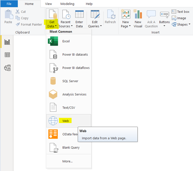
To import data into Power BI via REST API calls, open the Power BI Dashboard and click Get Data > Web:
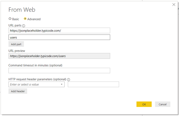
A new window will appear. There, you configure the task. Click Advanced to select the right working mode.
In URL parts, insert the complete URL of the data source that you want to access. Or you can write the base URL and then mention that data source you want to import in the Add part field.
In our example, we’ve entered https://jsonplaceholder.typicode.com/ as a base URL. To import the users’ data, we can enter users in the Add part field. The final URL preview is available in the respective URL preview field.
The final URL is https://jsonplaceholder.typicode.com/users – we can enter it directly to the URL parts field and leave the Add part field empty.
Furthermore, we can set the command timeout in minutes. It applies if we wish to wait for some time only and cancel the Test API call if we do not receive the data before the timeout period.
Click OK.
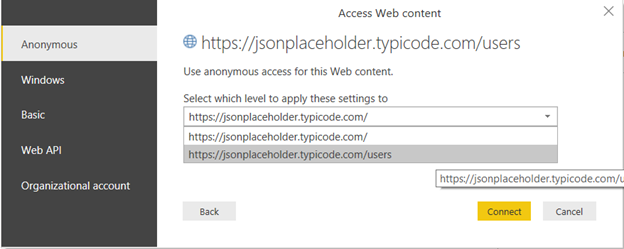
Provide authentication details to make a Rest API call via Power BI (several options are available as shown in the following screenshot). By default, you can make a Rest API call using anonymous authentication – click Connect to import the data.
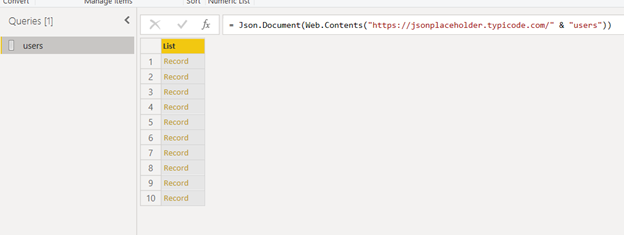
It may take some time to import all the data. Once it is done, the Power BI Query Editor will automatically open and present the imported JSON records in the list format:
Converting Data into Pivot Table via Power BI Query Editor
To create a visualization, it better to convert imported data into a table. We will do that later. First, we are going to explore the imported data.
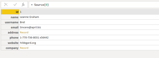
If you click on the first record in the picture, you will see that it contains 8 fields as shown below.
The hierarchical relations between individual JSON objects are maintained when you import JSON objects via REST APIs calls in Power BI. Hence, user objects contain address fields. The address field itself is a JSON object consisting of sub-fields.
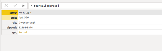
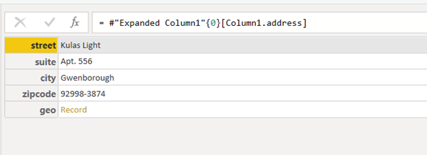
Click Record of the address field:
You will see sub-fields of the address – street, suite, city, zip code, and geographical location. The geographical location in its turn consists of more fields that you can click and view:
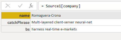
Similarly, if you click the Record link for the company field, you will see its sub-fields:
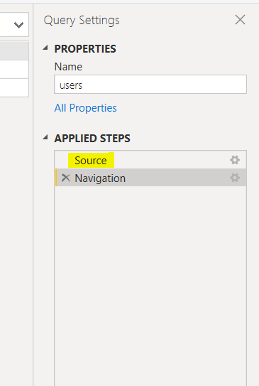
To get back to all records, click Source in the Applied Steps pane:
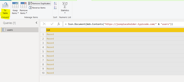
To transform the list of imported user records into a Power BI table, select the users‘ list and click To Table:
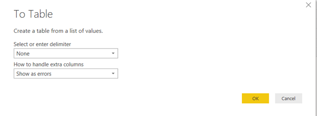
You will see the following dialogue box. Click OK.
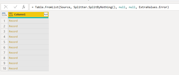
This way, you convert the list into a table with a single column as shown below:
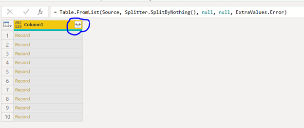
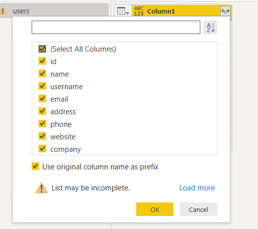
To create a table with multiple columns corresponding to fields of imported JSON objects, click the double arrow symbol next to the column name:
A new dialogue box will appear where you can see all fields. You can select the fields you want to include in your table. By default, all fields are selected. Click OK.
In the output, you can see all fields from the Users JSON objects, such as name, username, email, etc. as table columns:
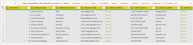
You can also see that the address and company columns contain Record as row values instead of address details or company details. This is because the address and company columns consist of multiple sub-fields you can see by clicking on row values i.e., Record:
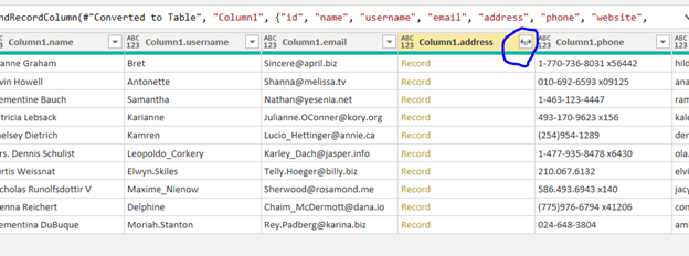
You can expand the address and company columns too. To expand the address column, click the double arrow symbol next to column name:
You will get the following dialogue box:
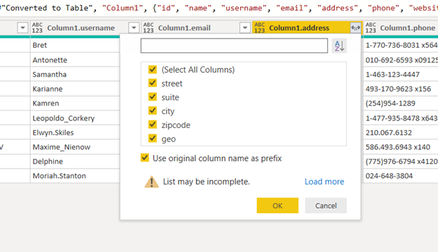
You can select sub-fields from the address column you want to add as columns to the original table. Select all fields and click OK. It will give you the following:
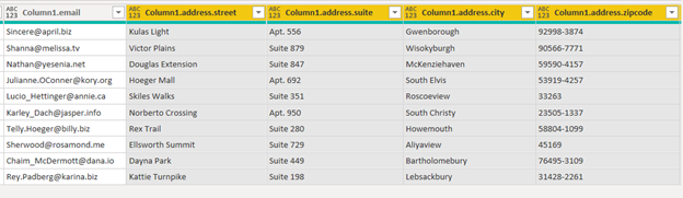
The sub-fields from the address field have been added as columns to the original table. In the same way, you can add sub-fields from the company column.
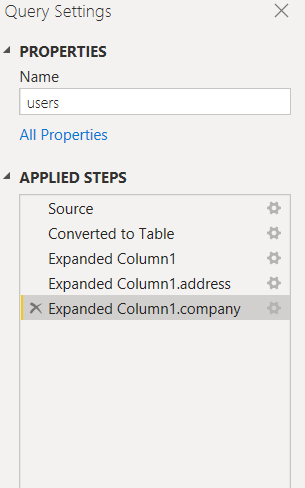
To plot visualizations, you need to open your data in the Reports View. To do this, click on the final step in the APPLIED STEPS pane – in our case, it is Expanded Column1.company:
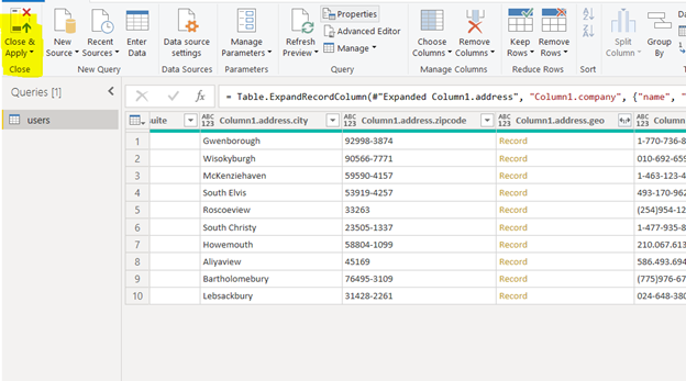
Next, click the Close & Apply button from the menu:
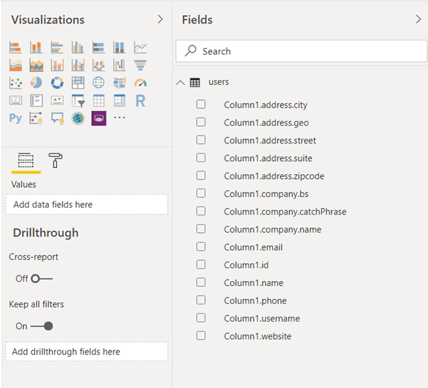
The reports view will automatically open. There you can see your table columns in the Fields:
Power BI Table Visualization in Reports View
Once you have transformed the data into the desired tabular form using the Power BI query editor, you can create a visualization with the Reports View.
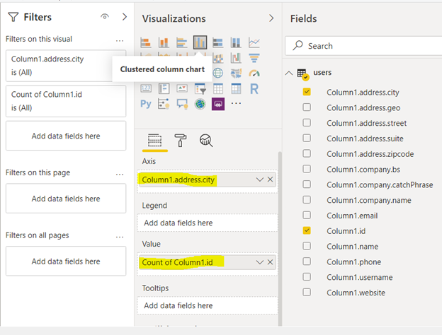
For Clustered column chart, click on the corresponding icon in the Visualizations window. To plot users against cities, you need to add Column1.address.city to the Axis field and Column1.Id in the Value field:
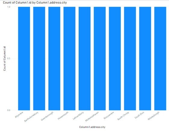
Here is the output – since there is only one user per city, you can see equal bars for all cities:
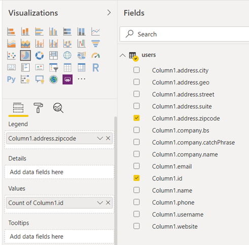
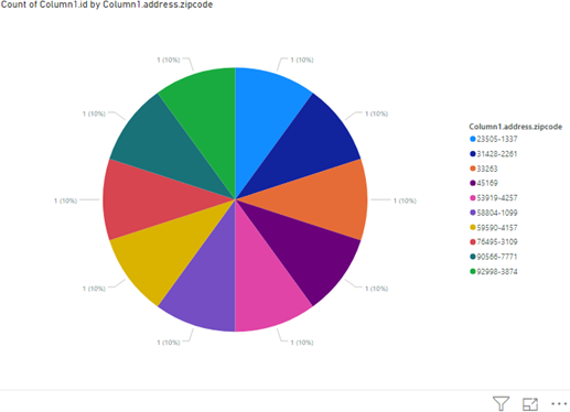
Similarly, you can plot a pie chart showing the count of users per zip code with the following configuration:
Since there is only one user per zip code, you will see the pie chart equally distributed among all zip codes:
Conclusion
Power BI imports data in many ways and from a variety of sources. The usage of power BI REST API calls is one of the available methods, especially for websites supporting REST APIs.
This method has its specificity, of course. First, we have to import the data as records and convert them to a table. Then, tables with JSON records must be expanded. We create separate columns for all properties in a record. However, after that, the data viewing and processing is much more convenient.
By applying the BI REST APIs calls, we can import data as JSON files from a remote location and work with it in the same way as with a local JSON file.